Setting up device visibility of sections and elements
You can set up Device visibility that is to select which devices will display a particular section or element. Choose from:
- all devices
- desktop only
- mobile only
- hidden
It is useful if you are creating a site for different devices. Desktop sites can be more sophisticated while sites on smartphones need to look more minimalistic.
Setting up section visibility
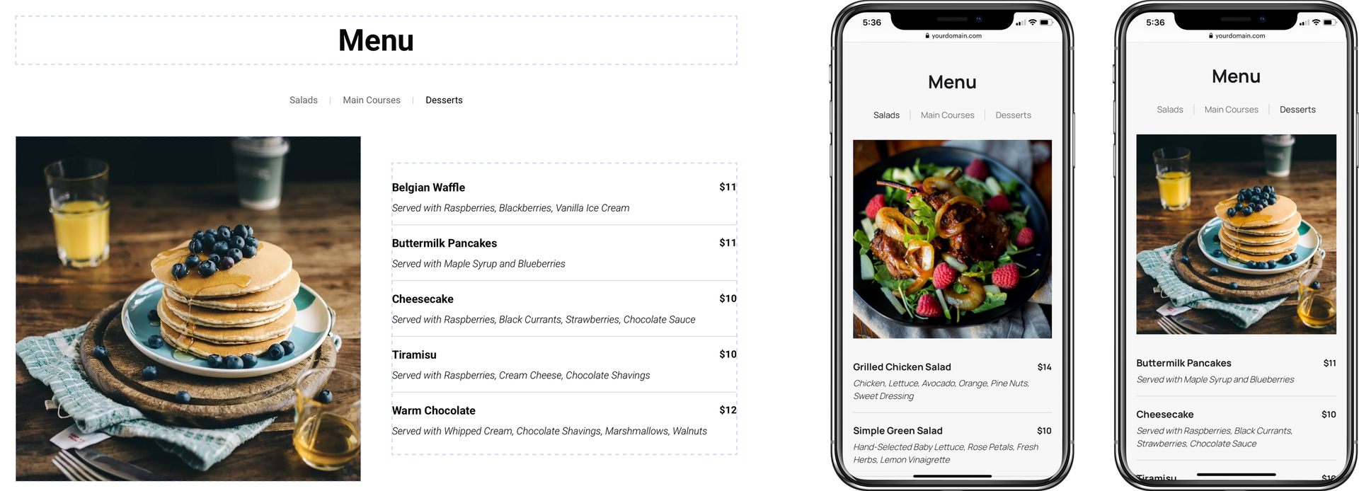
Imagine you have a section that looks great on PCs but is not suitable for mobile devices. It’s convenient to browse menu tabs on the large screen. But the same menu looks differently on a small smartphone screen.
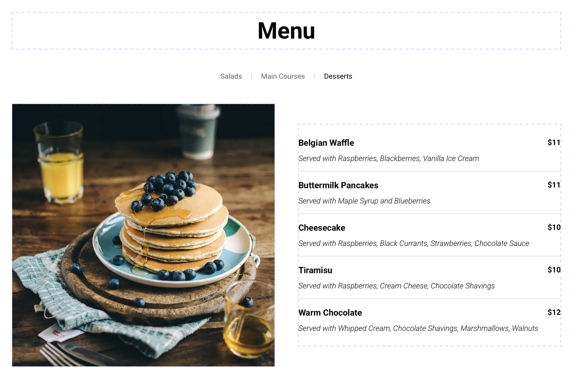
In this case, it's better to select visibility on Desktop only and design an alternative menu section for mobile devices.
You won’t have to create two sites (for PCs and mobile devices) as it will be enough just to set up visibility of each section for different devices.
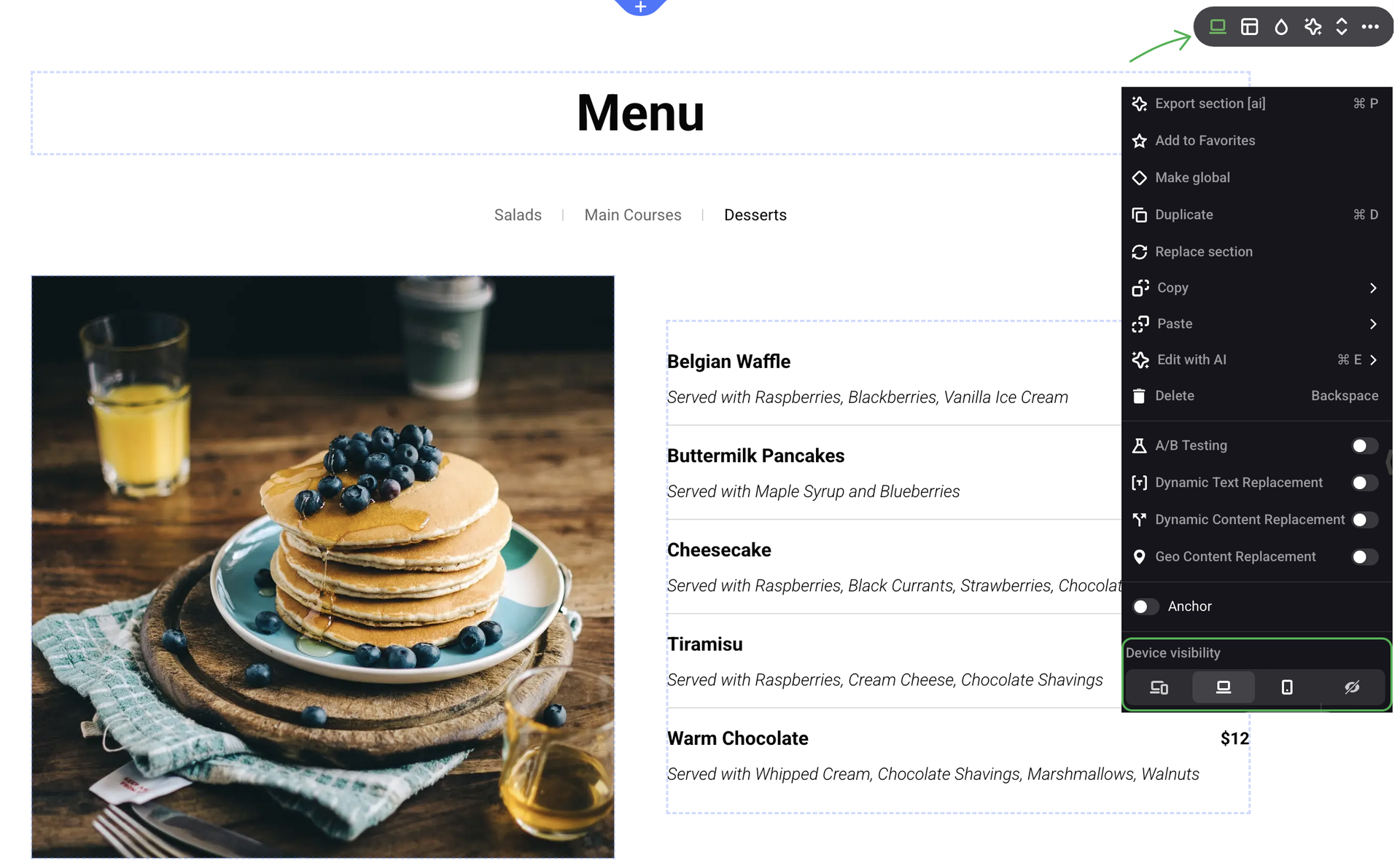
When Device visibility is enabled for a section, a green device icon appears in the top right corner.
Setting up element visibility
Sometimes there is no need to redesign the whole section — it’s enough to hide or change a couple of elements.
You can set Device visibility for any element. To do that, right-click the required element or open its Settings panel.
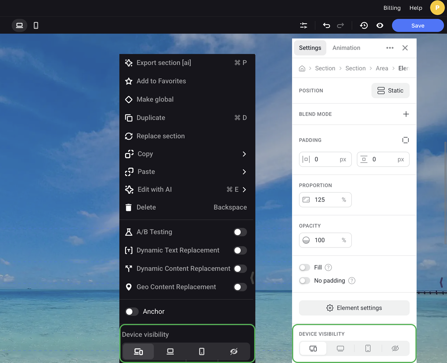
When Device visibility is set, a device icon appears in the center of the element container when it is unselected. When you select such an elements, this icon appears at the top right corner of its container.

NOTEThe number of sections influences the page load time so it’s always preferable to redesign elements instead of duplicating a section.