Special features of free sections
Types of sections in the editor
There are two main types of sections in the editor: Standard and Free sections.
Content in a Standard section is automatically aligned to the grid, and it adapts to different devices. You can fulfil 90% of all design tasks using standard sections.
You can also customize the design of standard sections using elements with absolute positioning. The rules to select the dots of binding and containers for such elements are the same as when you set up a free section.
Free sections let you move and rotate elements. This gives more freedom to create websites with unique design but also requires you to properly bind elements in the section, which allows sections to adapt to different devices.
NOTEMoving elements freely around the section is achieved thanks to the position:absolute CSS property.
Setting up the Full-screen mode in free sections
Full-screen mode means that a section, by default, takes up the whole viewport and its height automatically adapts to the viewport height.
You can set up the following parameters of the full-screen mode in the free section:
- Height
- Minimum height
- Maximum height
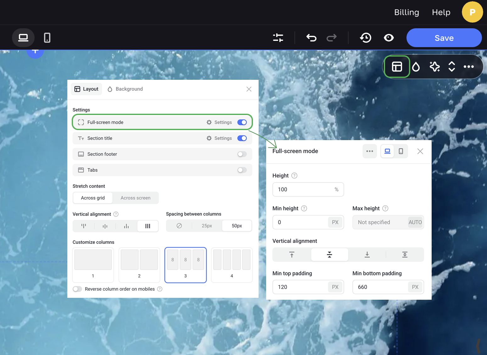
Height
By default, a full-screen mode section takes up 100% of the visitor's viewport. If Max height is also set and its value is bigger than the viewport height, the Height value is ignored and the section becomes scrollable.
Min height
It's the height value of a section or an element that is retained even for the smallest viewport. If a visitor's viewport is smaller than this value, the section becomes scrollable.
Minimum height is a fixed value, it is specified in pixels (px).
Set the minimum height value to fit the section tightly. The same rule applies to free pop-ups and other elements that have a minimum height setting.
NOTEIf you are building a site with a big-screen computer, do not specify too large Min height values. This will make your section, element or pop-up take up several viewports on small screen devices.
Maximum height
It's the height value above which the section won't be displayed even on the larger screen devices. For example, if you specify a maximum height of 1500 px and the visitor's viewport is 2500 px, the section will still be displayed with the height of 1500 px.
How absolute positioning works
Every element in the section is placed to the container. The grid, the viewport itself, any card or pop-up can serve as a container.
The container serves as a parent for an element. When the viewport size changes, the element changes its location relative to its parent on devices with different viewport sizes.
When the viewport size changes, the element with absolute positioning "disappears" from its initial place and its position is calculated anew. Other elements in the section are not taken into account, their positions are ignored.
That's why it's crucial to select a proper dot of binding and container for each element of the section in order to create sections that are displayed correctly on all popular devices.
For example, let's add a Shape, an element with absolute positioning. We select the Grid as its container to define positioning. We bind the element to the top left corner of the grid. The selected dot of binding will be the origin of coordinates along the X and Y axes.
Choosing a dot of binding
There are 9 dots of binding to position absolute elements. To choose the right dot of binding, imagine that the container with the element has started to resize. Where should the element be located after the container has finished resizing?
If the element should be located at the bottom in the center of the section, then choose Center Bottom as the dot of binding. To ensure that the element is set at the top right corner, then choose Right Top, etc.
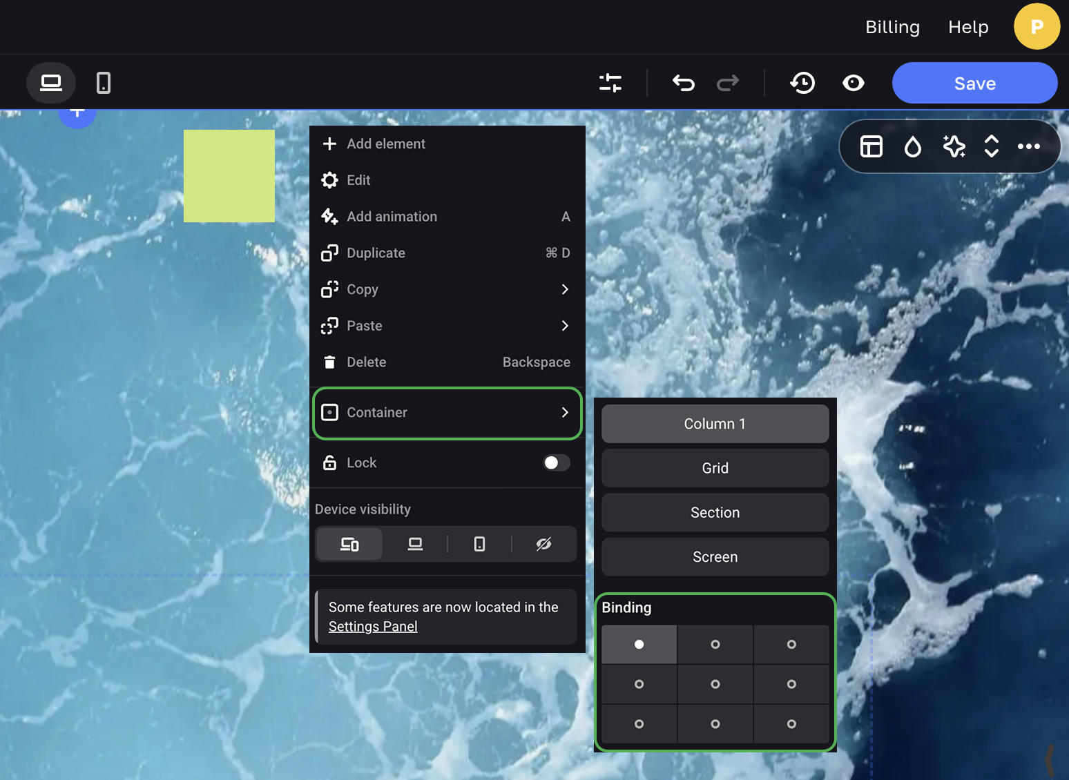
Choosing a container to bind elements
The container is the area where an element is located. For example, an element can be bound to the grid, to a pop-up, to the screen, to a column, or to a card. The container serves as the parent for an element. When the viewport size changes, the element changes its location relative to its parent.
Binding to the grid
In the free section, the Grid is the most common container for an element. To enable or disable the Grid display in the editor, press ALT + G.
The grid has a width of 1150 px and it is suitable for adapting the section to most viewport sizes, so you should place all the main elements of the section within the grid. Therefore choose the Grid as the container for such elements.
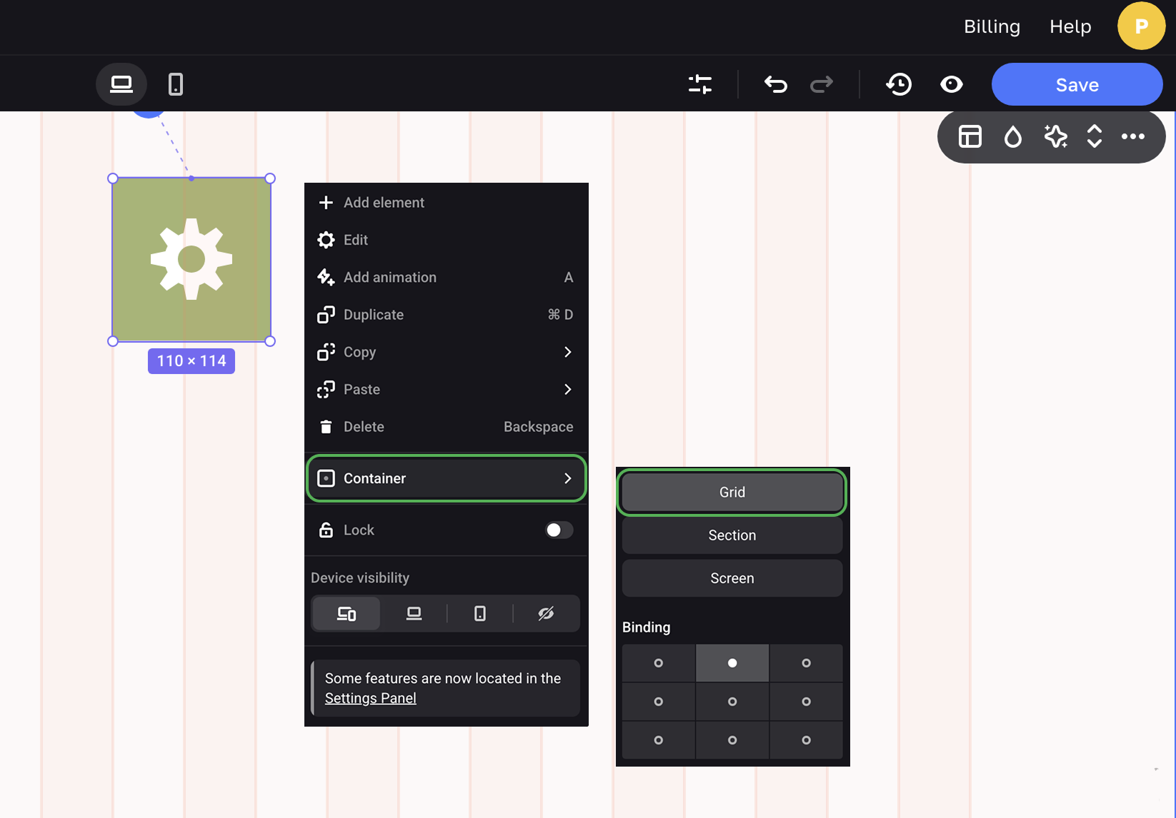
Binding to the screen
When you choose the Screen as the container for an element, the element is positioned relative to the user's viewport. When the size of the viewport changes, the element is relocated.
It comes in handy for elements located outside the grid, for example, for custom-designed elements that adorn sections. It's also suitable for a free section that you turn into a viewport-wide header of your site.
The video below shows the difference between binding elements to the grid and to the screen. The header elements (logo and menu) and the background grass are bound to the Screen. The button and text elements are bound to the Grid.
You can see how the elements keep their positions relative to the specified coordinates and set containers, while changing the viewport size.
You can see how the elements keep their positions relative to the containers and dots for binding while the viewport size is changing.
Setting up dots of binding and containers on mobile devices
You need to set up positioning of absolute elements on mobile devices separately from the Desktop version of your site. To go to the Mobile phones mode, click the icon on the editor panel.
You can set up the size, position, and dot of binding for elements on mobile devices.
NOTEYou cannot customize containers for mobile devices.
For example, if you duplicate an element in the Desktop version and drag it to another section, on mobile devices this element will remain bound to the old section.
This will cause the element to "disappear" (go below the section) on scroll. To avoid this on mobile devices, always add the element to the section (container) where the element will actually be located.
Keyboard shortcuts
Learn more about available keyboard shortcuts.