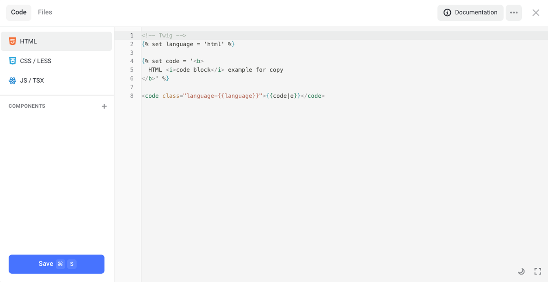
HTML editor
HTML
After adding an HTML block (section, pop-up or element), you can inject any third-party code. Use the HTML tab only to add custom elements or to display widgets in the particular part of your page (for example, to display a calculator).
If you need to add a counter, go to the Settings → Code Injection.
To embed counter code to a particular page, use the Code tab on the upper panel.
Learn more about how to embed third-party code snippets on your site in a proper way.
We recommend against embedding JavaScript code in the script tags; it's better to use the JS / TSX tab instead.
NOTEBe cautious while inserting code because an unclosed tag can ruin the layout of your content placed after the HTML section.
Visibility on devices
You can manage visibility of your site's content on various types of devices using the attributes:
[data-hidden="desktop"]— to hide content from desktop computers and display it only on mobile devices;[data-hidden="mobile"]— to hide content from mobile devices and show it only on desktop computers;[data-hidden="all"]— to hide content from all types of devices.
1<div class="text" data-hidden="mobile">
2    Hidden on Mobile
3</div>
4
5<div class="text" data-hidden="desktop">
6    Hidden on Desktop
7</div>
Using links to perform various actions
You can use anchor links:
- to set up scrolling to a section
- to open pop-ups / cart
- to add products
- to send goals to analytics services, etc.
To open a pop-up, specify its ID as the anchor link.
To open the cart, use the #cart anchor link.
To follow an anchor link or element ID, use the link that looks like.
You can set up link behavior using the following attributes:
[data-goal="GOAL_NAME"]— the name of a goal that will be sent to your analytics service;[data-action="ACTION_NAME"]— specifies the type of an action that happens after the link is followed. This attribute triggers the goal set up in your analytics service. If the attribute isn't specified, then the link value is used.
| ACTION_NAME | Description | Goal | Additional attribute |
|---|---|---|---|
| link (by default) | Open a link / a pop-up / the cart Follow an anchor | link_open | href="URL" — Link URL target="_blank" — Open in a new tab |
| cart | Add to the cart | add_to_cart | data-product-image="/img/201820_60.jpg" Path to a product image data-product-name="Product name" Product name data-product-price="1000" Price for a product unit data-product-count="1" Quantity of products to be added |
| file | Download a file | file_load | href="URL" — Path to a file download — Force downloading files that can be opened in the browser (PDF files, images) |
| modal | Open a pop-up | modal_open form_open done_open product_show quiz_start | data-modal-id="MODAL_ID" ID of a pop-up to be opened |
| close | Close a pop-up (only for pop-ups) | modal_close | – |
| none | Don't handle | – | – |
Add--to-Cart code snippet
1<a
2    data-action="cart"
3    data-product-image="/img/9512942_1150.webp"
4    data-product-name="Black Hoodie"
5    data-product-price="15990"
6>
7    Add a product to the cart
8</a>
Open-a-Pop-up code snippet
Trigger-a-Goal code snippet
1<a
2    data-action="none"
3    data-goal="my_custom_goal"
4    href="#anchor"
5>
6    Follow the anchor and run the goal "my_custom_goal"
7</a>
Opening images in the pop-up
To open images as a lightbox in a pop-up, use the [data-lightbox="IMAGE_URL"] attribute. Add the alt attribute to describe images.
By default, all images with the data-lightbox attribute are grouped into the image carousel. If you want to restrict the search area for such images, use the .lightbox-container class.
Example of using this attribute
1<div class="lightbox-container">
2    <img
3        alt="Image #1"
4        src="/img/2000018199_600.jpg"
5        data-lightbox="/img/2000018199_1920.jpg"
6    >
7
8    <img
9        alt="Image #2"
10        src="/img/2000018200_600.jpg"
11        data-lightbox="/img/2000018200_1920.jpg"
12    >
13</div>
Lazy loading of images
You can set up the lazy loading of images. Lazy loading means that images start to load only when they enter the viewport.
Use the following attributes:
[data-lazy-bg="IMAGE_URL"]— to add the inline background-image style to an element when an image enters the browser's viewport;
[data-lazy-src="IMAGE_URL"]— to add the src attribute to an element when an image enters the browser's viewport;
[data-inline-bg="IMAGE_URL"]— to add the inline background-image style to an element when the page starts loading;
[data-inline-src="IMAGE_URL"]— to add the src attribute to an element when the page starts loading.
Use the %optimalWidth% variable in the file path to automatically load an optimal width version of the image.
Learn more about the path formats in the Files tab.
NOTEFor Lazy loading to work properly, the width and height of each image should be explicitly specified in the CSS styles.
CSS / LESS
LESS pre-processing language is used in the CSS tab. Here you can add any features described in the documentation on LESS.
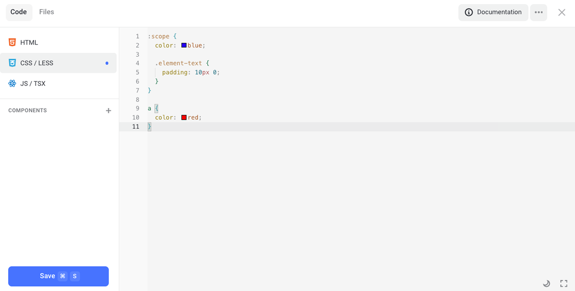
Visibility scope
The scope of styles is restricted by the :scope or :host selector. However, if you do not specify this selector, the whole code will be wrapped in it automatically. Thus, two examples below are identical.
The :scope selector is applied to the content part of an element. If you need to set up the style of an element container, use the :host selector instead.
Using the :root selector allows you to apply styles to the whole page, not only to the current element.
Responsive design
You can override styles for different types of devices using the .adaptive-desktop and .adaptive-mobile classes applied to the body.
Classes applied to the body
| className | Description |
|---|---|
| adaptive-desktop | Current site's display mode (PC) |
| adaptive-mobile | Current site's display mode (Mobiles) |
| is-touch | Device with touch screen |
| is-pointer | Device with cursor |
| is-ios | iOS device (iPhone, iPad) |
| is-android | Android device |
| is-safari | Safari browser |
| is-chrome | Chrome browser |
| is-edge | Edge browser |
| is-firefox | Firefox browser |
Example of using classes
// Red colored element in Chrome for iPhone devices
body.adaptive-mobile.is-ios.is-chrome {
    :scope {
    	color: red;
    }
}
CSS variables
You can use system CSS variables in your styles. See the list of applied variables below.
| Variable | Description |
|---|---|
| var(-currentColor) | Current text color |
| var(-contrastColor) | Color contrasting to current text color |
| var(-bgContrast) | Color contrasting to current background color (it differs from -currentColor in case when text color isn't set to Auto) |
| var(-lightColor) | Light color |
| var(-darkColor) | Dark color |
| var(-100vw) | 100% viewport width |
| var(-100vh) | 100% viewport height |
| var(-coverHeight) | Height of full-screen sections (it doesn't change when the screen size is changed slightly) |
| var(-scrollbarWidth) | Scrollbar width on the current device |
| var(-containerWidth) | Container width (1150px) |
| var(-containerMaxWidth) | Maximum container width (100%) |
JS / TSX
Use the JS / TSX tab to write your own logic.
Make sure that:
-
 ️ jQuery is already loaded.
 - ️ The code runs after in the DOMContentLoaded event.
- ️ You can use upper-level await and ESM syntax.
- ️ The elementApi object is used to access the properties of the current HTML element.
Uploading dependencies (ES Module Import)
You can use ES Module Import syntax to connect the required dependencies in the ESM format.
We recommend using esm.sh content delivery network (CDN).
You can upload any JS/CSS files (in the CJS format) using the require method. Using this method works the same way as adding JS/CSS code in the HTML tab using script or link tags.
The method accepts two arguments:urls: string | string[] — file path or list of paths to be loaded (CSS or JS files)callback: () => void — function that will run after loading is complete
Example
1function main() {
2    console.log('THREE.js loaded', THREE);
3}
4
5require(
6    ['https://cdnjs.cloudflare.com/ajax/libs/three.js/r128/three.min.js'],
7    main
8);
JS API
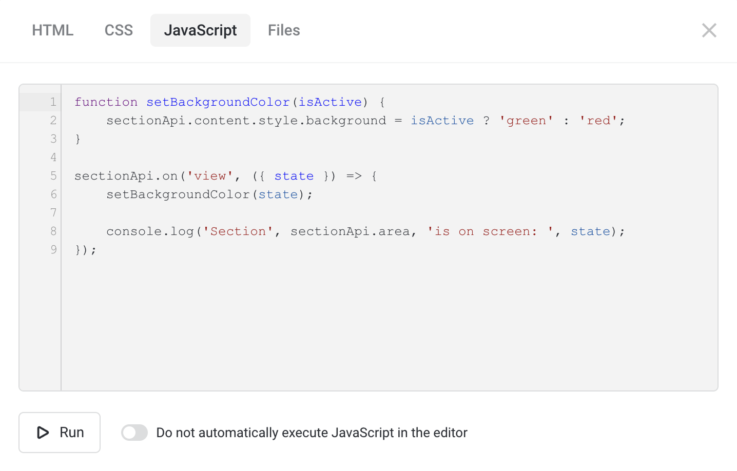
You can set up any element or section that enters the viewport. Use the elementApi object to access the properties of the current HTML element. You also have access to the parent object, sectionApi or modalApi depending on the location of this element.
Available object fields
| Object field | Description |
|---|---|
| id | Unique section ID |
| is | Element type (block, modal, element) |
| area | DOM element of the entire element/section We do not recommend changing its properties. |
| content | DOM element of the section content container Use it to address the DOM element of the current HTML element. |
| inScreen / wasScreen | Section is in the viewport / was in the viewport |
| inView / wasView | Section is more than 25% visible / was 25% visible |
| inFocus / wasFocus | Section is in the viewport center / was in the viewport center |
| inBeside / wasBeside | Section is beside the viewport / was beside the viewport |
| isVisible / wasVisible | Section is visible or hidden now / was visible at least once |
Example of using API
1function triggerOnScreen() {
2  if (!flexbe_cli.is_admin) {
3    flexbe_cli.events.trigger('ui_modal_open', { id: 'my_fancy_modal' });
4  }
5}
6
7// If, on page load, the element is already in the viewport
8if (elementApi.inScreen) {
9    triggerOnScreen();
10}
11
12// Register event of entering the viewport
13elementApi.on('screen', ({ state, first }) => {
14    if (state && first) {
15        triggerOnScreen();
16    }
17});
18
Available events inside an element / section
| Event name | Description |
|---|---|
| beside | Section will soon appear in the viewport |
| screen | > 1px of the section is visible in the viewport |
| view | > 25% of the section is visible in the viewport |
| focus | Section is crossing the viewport center |
| visible | Section becomes visible or hidden (its state changes from display: none to display: block). It applies to pop-ups, elements in tabs, etc. |
| resize | Element size has changed |
| open | Pop-up was opened |
| close | Pop-up was closed |
Example of event registering
1elementApi.on('screen', ({ state, first }) => {
2    console.log('Element entered and left the viewport', { state, first });
3});
4<p class="markdown-br"></p>
5
6sectionApi.on('resize', () => {
7    console.log('Section width or height has changed');
8});
9
Programmed opening / closing of pop-ups or the cart
1// To open a pop-up modal96352 (anchor can be used)
2flexbe_cli.events.trigger('ui_modal_open', { id: 'modal96352' });
3
4// To close a pop-up (open or specific)
5flexbe_cli.events.trigger('ui_modal_close');
6flexbe_cli.events.trigger('ui_modal_close', { id: 'modal96352' });
7
8// To open the cart
9flexbe_cli.events.trigger('ui_cart_open');
10
11// To close the cart
12flexbe_cli.events.trigger('ui_cart_close');
13
Opening / closing of a pop-up or the cart also triggers an event that can be registered as well.
1// Pop-up was open
2flexbe_cli.events.on('modal_opened', (payload) => {
3  console.log('Pop-up was open ', payload.id);
4});
5
6// Pop-up was closed
7flexbe_cli.events.on('modal_closed', (payload) => {
8  console.log('Pop-up was closed ', payload.id);
9});
10
11// Cart was open
12flexbe_cli.events.on('cart_opened', () => {
13  console.log('Cart was open');
14});
15
16// Cart was closed
17flexbe_cli.events.on('cart_closed', () => {
18  console.log('Cart was closed');
19});
20
Files tab
Use this tab to upload files that accompany your code.
Keep in mind the following:
-
 Files are not deleted after an HTML section is removed.
 - All files are available on all pages of the site.
- File size should not exceed 15 MB.
Enable image optimization option affects the way file paths are listed. If this option is turned on, then the links to optimized images are generated (their settings depend on the setup in the Settings → Speed Optimization.
You can specify your own path to an image.
Supported path formats
- /img/{id}_ {size}_q{quality}.{extension}
- /img/{id}_ {size}.{extension}
- /img/{id}.{extension}
| Variable | Description |
|---|---|
| %id% | Unique image ID |
| %size% | Image width If the original size of an image is less than this value, the image is generated in its original size. |
| %quality% | Image quality An optimal value is in the range of 65—85% depending on the file format. |
| %extension% | Image format (AVIF, WebP, JPG, PNG, GIF) |
Example
- /img/19790179_1280_q65.webp — an HD image in the WebP format and 65 quality (1280x1021px, 250Kb)
- /img/19790179_1920.jpg — a Full HD image in the JPG format (1920x1532px, 460Kb)
- /img/19790179.jpg — an original image (3024x2413px, 1558Kb)
To speed up the performance of your pages, try to find an optimum size for each image.