Static elements
An element is a minimum unit of content, such as a button, text, image, icon, etc. There are 2 main types of elements depending on their position: Static and Absolute. Static elements are bound to their containers within the section. Absolute elements can be placed anywhere on the page.
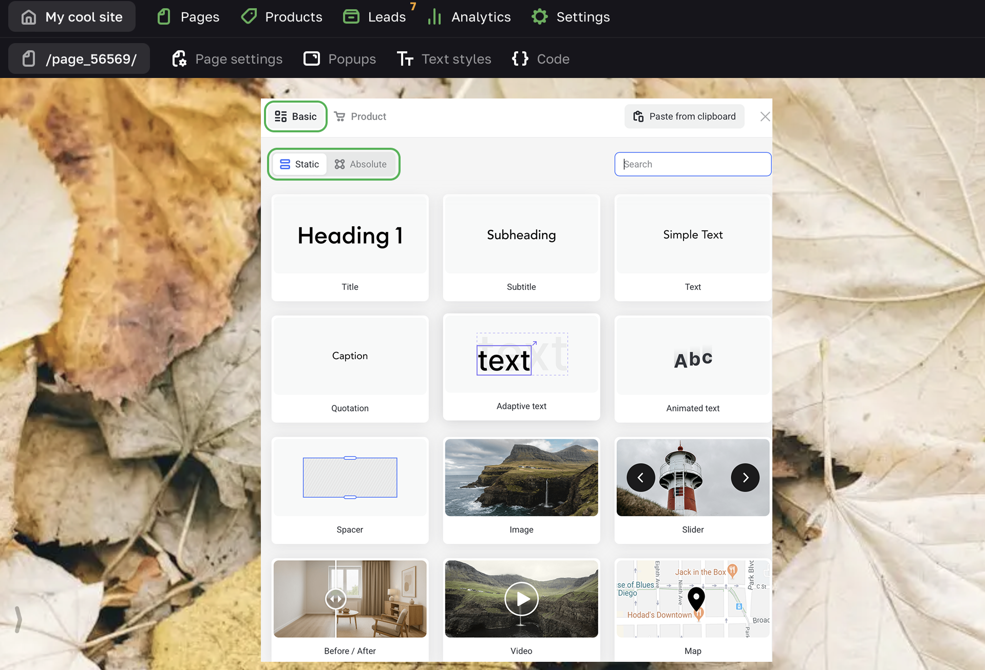
When adding an element you can choose between two tabs: Basic and Product. The Product tab contains elements (such as SKU, product options or availabilyt) that are useful for selling goods and services. Though you can use them in any section that you see fit.
When you add a page or a new section, you get a ready-made template with some basic elements. They serve as examples to show design and possible use of each particular section.
You can edit any element on the page. Here is an example of editing the Button element.
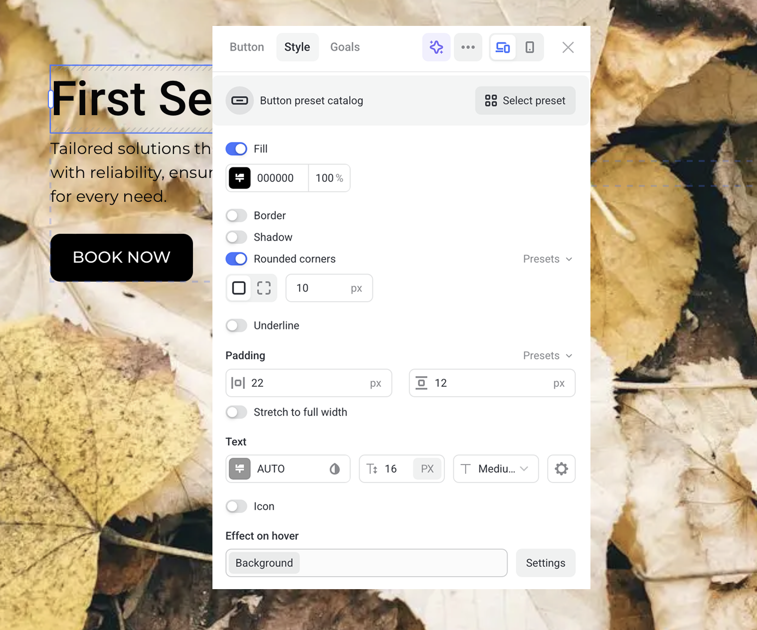
The visual editor allows you to instantly see changes made to the site.
Adding an element
If you want to add an element to a section that already has content, then hover over the top or bottom border of the current element and click on the  icon. Then choose an element from the list.
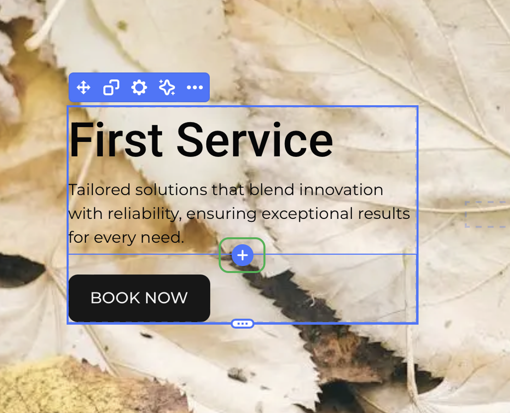
You can also add a new element by right-clicking on any empty space of the page.
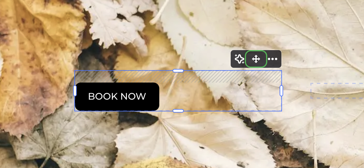
Moving an element
To move an element, mouse over it and go to the control panel in the top right corner. The left button on the panel moves the element within the section or between the sections. Click the Move button to drag the desired element around the page.
Copying an element to clipboard
Click the ellipsis icon and select Copy -> Copy to clipboard if you want to copy an element with all its settings to use it later on any page of the current site. Select Copy style if you want to apply your designs to another element.
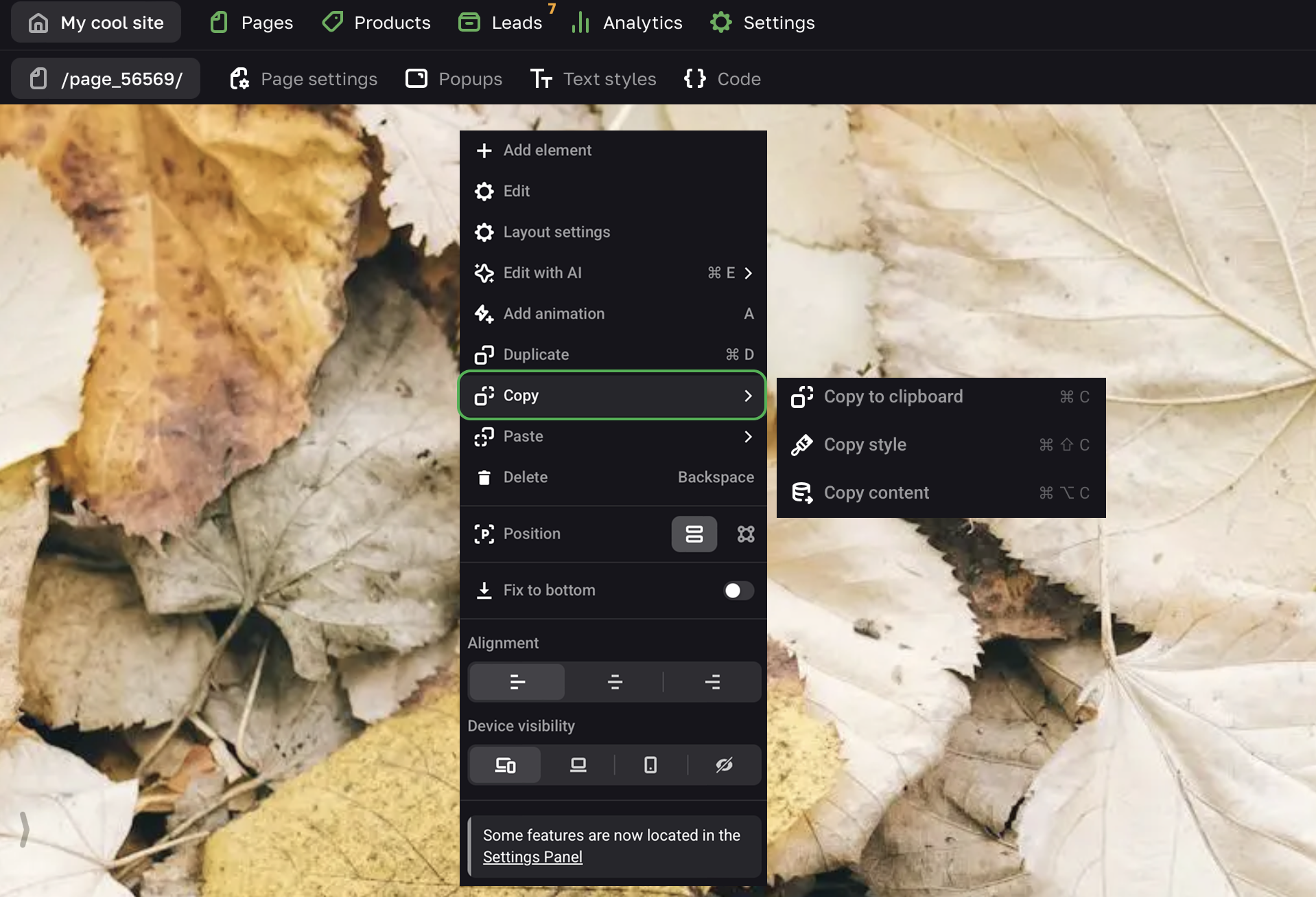
To copy an element to the clipboard, click Ctrl + C or ⌘ + C. To paste the last copied element from the clipboard, click Ctrl + V or ⌘ + V.
Duplicating an element
To duplicate an element to the current page, mouse over it and go to the control panel in the top right corner. Then click the “…” button and select Duplicate.
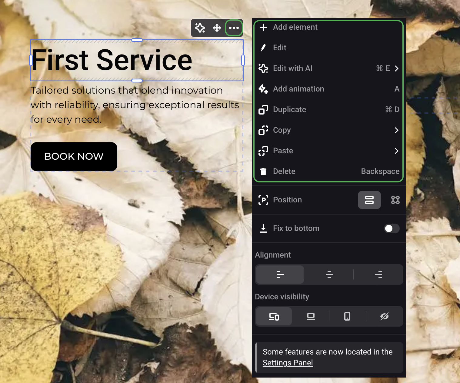
Deleting an element
To delete an element, mouse over it and go to the control panel in the top right corner. Then click the “…” button and select Delete.
Text editing
You can start editing any Text element (title, subtitle, text, animated text, quotation) after its adding.
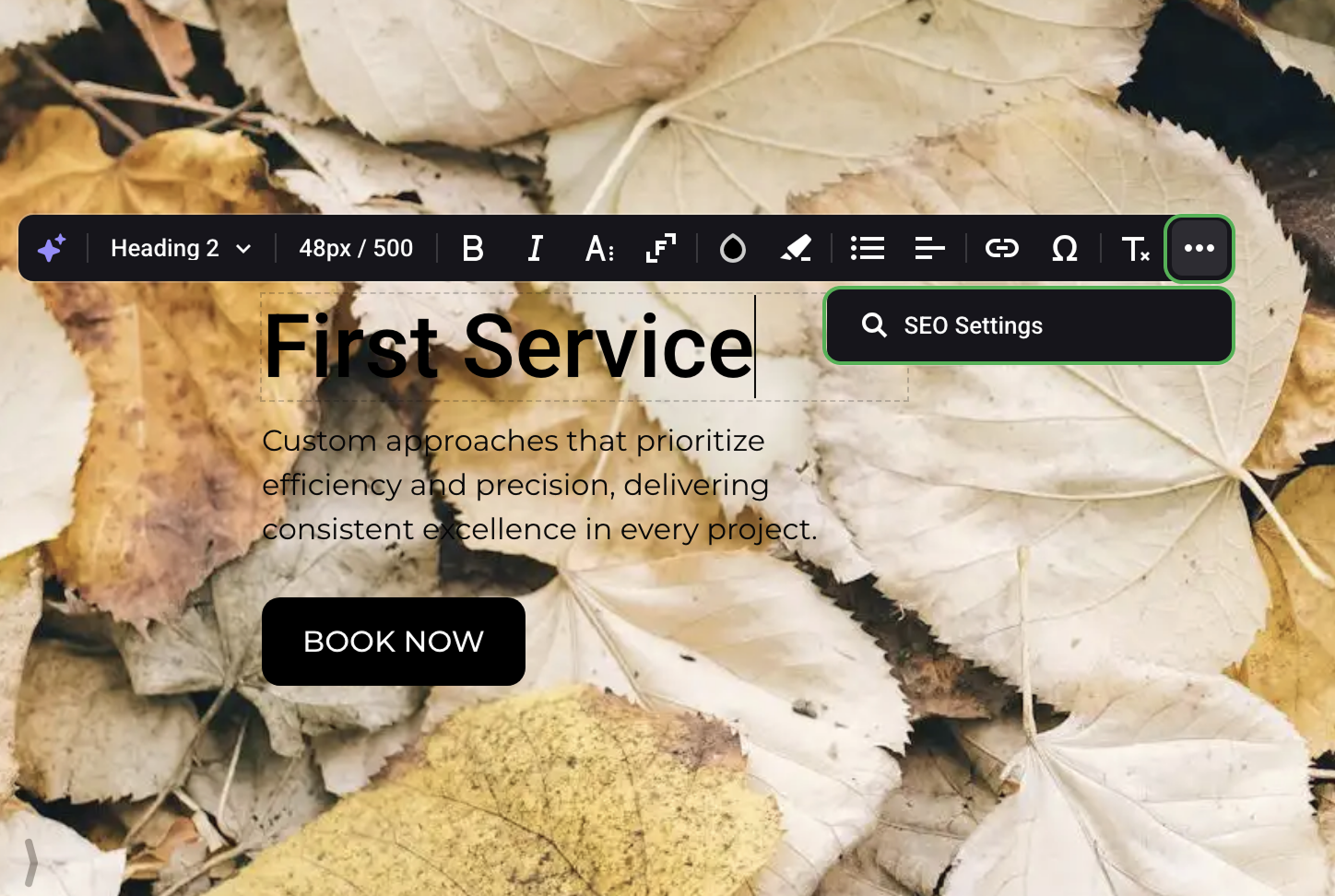
Text is edited right on the page. To open the text editor, hover over the text or select any word.
You can select font style and color, insert and edit a link, add a currency symbol, set up alignment and parameters of the text, add a list, change text style.
Click the “…” button to enter SEO Settings of the text element.
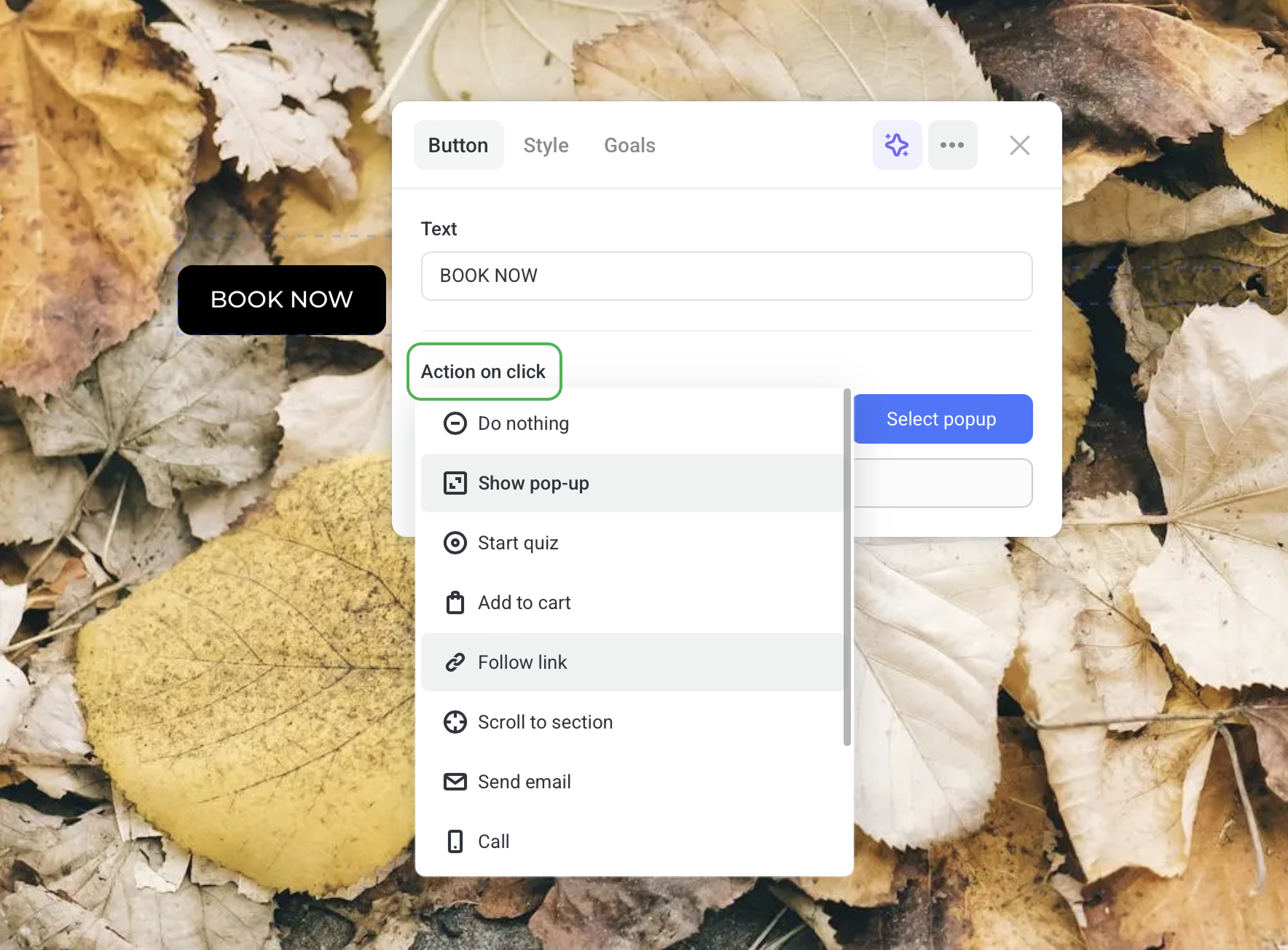
Actions on click
Such elements as buttons, forms, images, menus and sliders have the Action on click option to set up what happens when visitors click on them. Each element has its unique set of actions. Here is a comprehensive list of available actions:
- Add to cart — It’s a setting that allows adding shopping items to the cart.
- Call — Customers can click on a button or an image to call the phone number you’ve given.
- Download file — By clicking a button, visitors can download an image, a PDF file or a presentation.
- Follow link — Set up this action for a button, form or image to take site visitors to any page/site on your account or any site on the Internet. To do this, enter the URL of the required page/site. You can also enter an anchor link to a particular section on any other page of the current site.
- Lightbox — This setting allows visitors to zoom images and sliders by clicking on them.
- Proceed to payment — If you have connected a payment gateway, visitors can make payments right on the site. This option is set up only for the form element as you need to request visitors’ e-mail addresses to send back their receipts.
- Scroll to section — Сlicking a button, form, image or menu takes your visitors to any section chosen on the page.
- Send email — Clicking a button or image opens an email agent with the contact email address and subject (optional) you’ve given. It can be used to send CVs, leave testimonials or ask questions to the support team right on the site.
- Show pop-up — Clicking a button, form or menu opens a pop-up window. You can select a quiz, form, “thank you” window, product card, map from the list of templates or set up your own pop-up.
- Start quiz — Clicking a button opens a quiz modal window.
- Use button settings — If there is a button in the section, an image or slider can use the same action on click as this button. For example, it comes in handy in product cards: a customer who’s ordering food delivery from a restaurant clicks on the dish images. Every clicked dish is added to the cart — as if the customer clicked on the Order button.
NOTEIf there are two or more buttons in one section or product card, than all images and sliders in this section or product card will use the settings of the button located first from the top.