Responsive design
Responsive design provides appropriate display of your site on mobile phones and tablets.
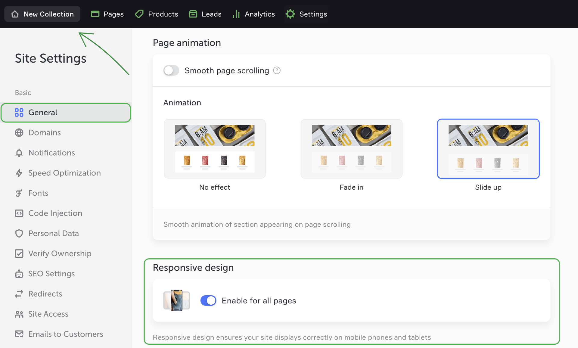
By default responsive design is enabled. You can disable it in the Settings → General.

There are no separate settings to display sites on mobile devices.
NOTEBy default, background videos are turned off on mobile devices because they make sites load slowly and spend mobile internet traffic. Such videos are cut off on small screens, plus the content fills most of the screen and background videos aren’t visible anyway.
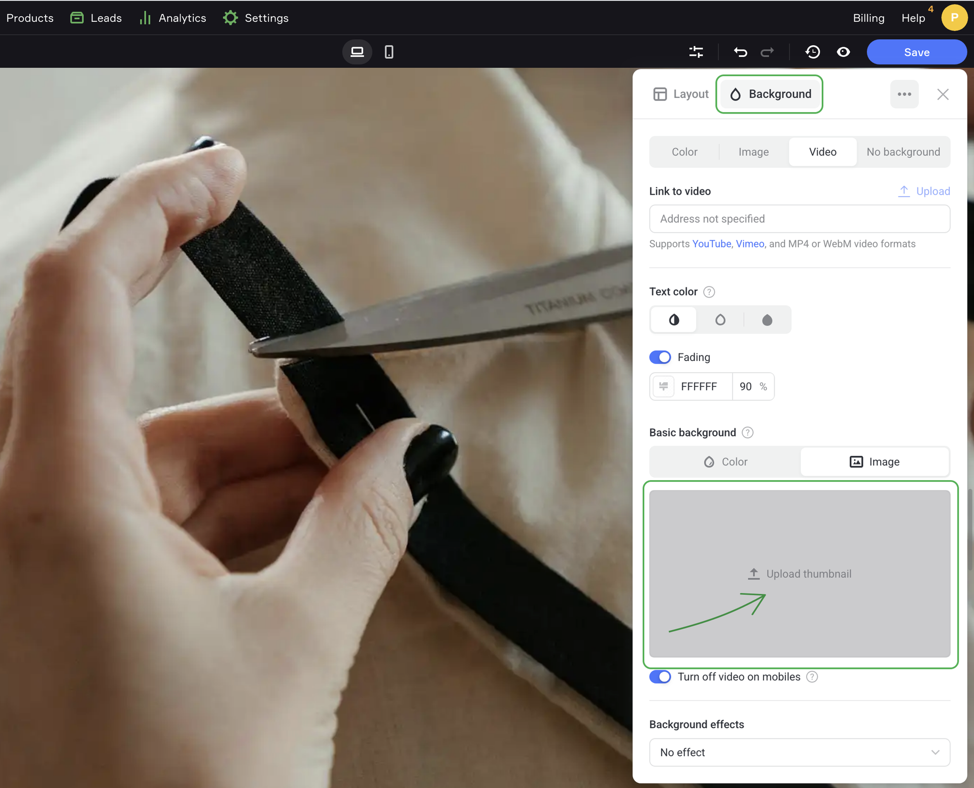
However, you can upload an image that will be shown on mobile devices instead of the video. To upload a background image for mobile devices, click Upload thumbnail in the Background settings.

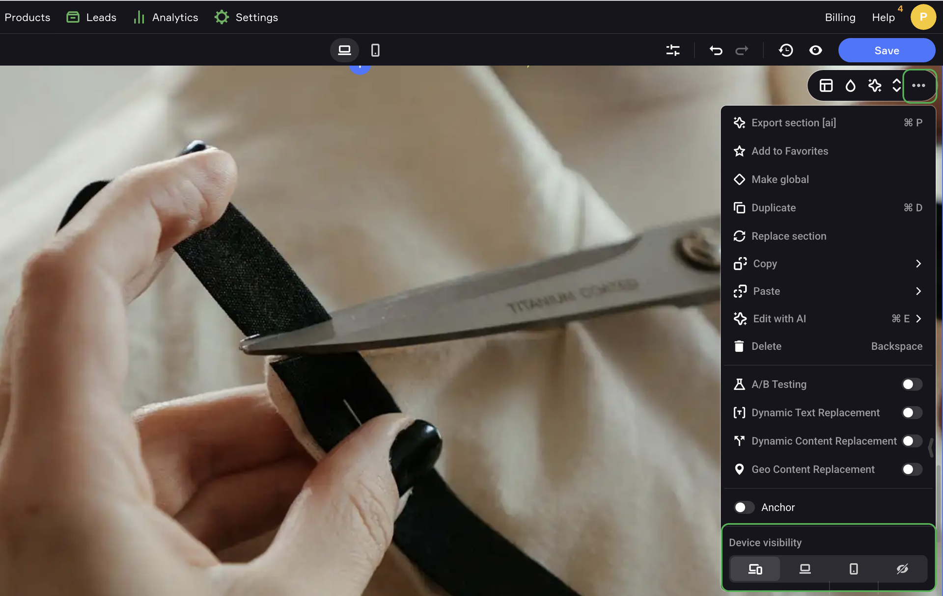
All sections and elements have a Device visibility mode. To set it up, click the “…” button in the top right corner.

Here you can select to display a section on all devices, on desktop computers only, on mobile devices only or to hide everywhere. This setting is applied only when the Responsive design is enabled.
How to prevent images from being cut off on mobile devices
We recommend against using images with words or texts because they are cut off in the smaller viewports of mobile devices so visitors can see the image only partly.

Upload an image first, then add the Title and Text elements. In this case the design will adapt to the screen size and your pages will display correctly on different devices.
Texts incorporated into images are not indexed by web crawlers — your prospective customers won’t be able to find your site.
Moreover, it will be impossible to edit such text later. You will have to change the whole image.
Designing the above-the-fold of your site
The above-the-fold should contain a call-to-action (CAT). Long copy is cut off on mobile devices perhaps even before reaching the CAT. Moreover, when there’s too much text, visitors are unable to see the accents on your page.
Write a concise title that tells who you are and what you offer. Add a compelling CAT, a couple of clarifying sentences, and move on to other sections.
You should design the above-the-fold so that it can fit on mobile devices.