Product cards
To set up a product card, go to the section Layout settings and select the Card tab.
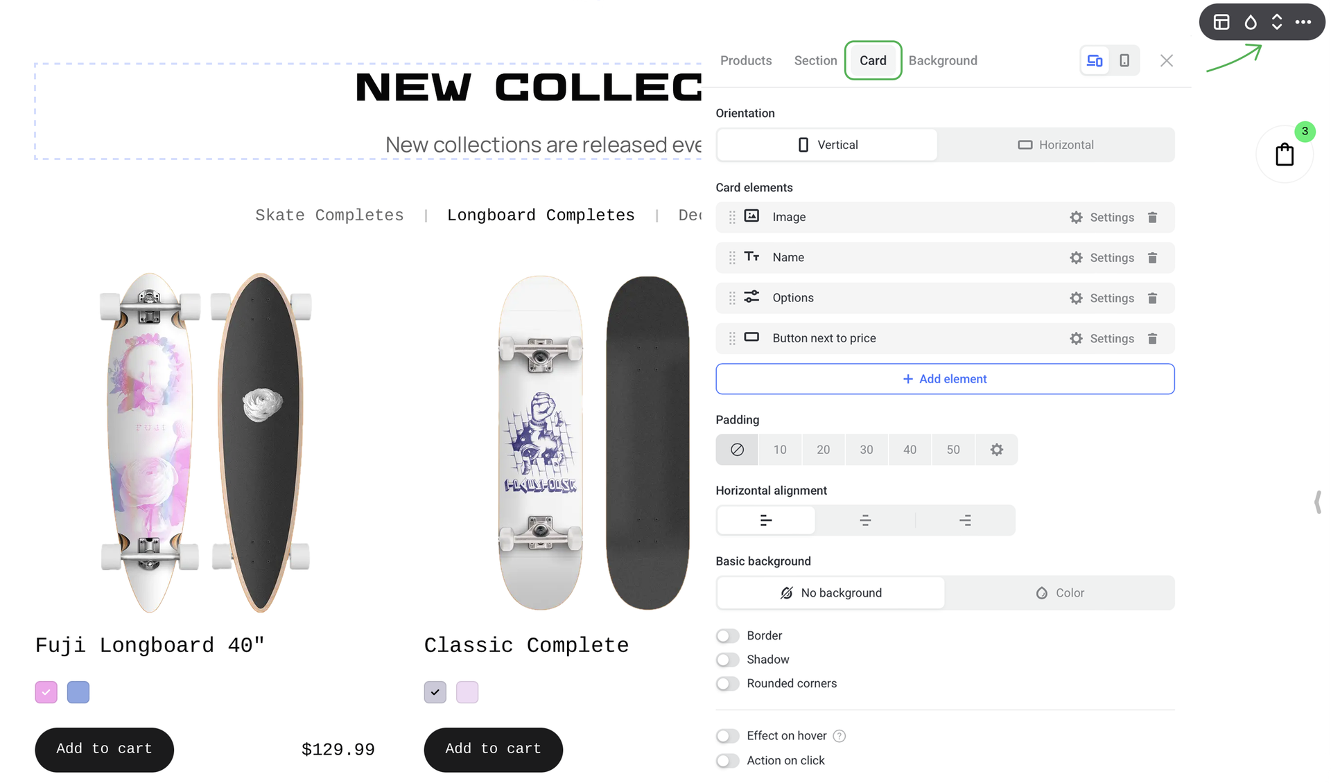
NOTEAll product cards in one section have common settings — it's impossible to set up each card individually. Any changes are automatically applied to the whole section.
Card orientation
It sets up the card layout of the Products section. You can choose between Vertical and Horizontal orientation. This setting is applied to the whole section.
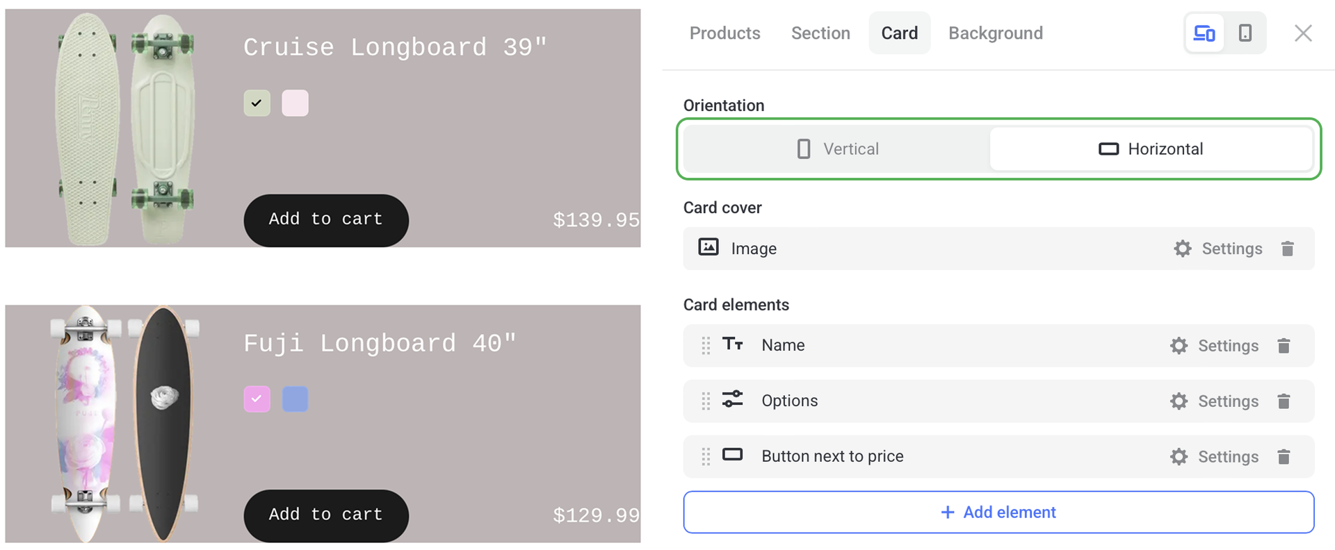
Card elements
This option works like a card builder as it lets you decide which information to include in the product card.
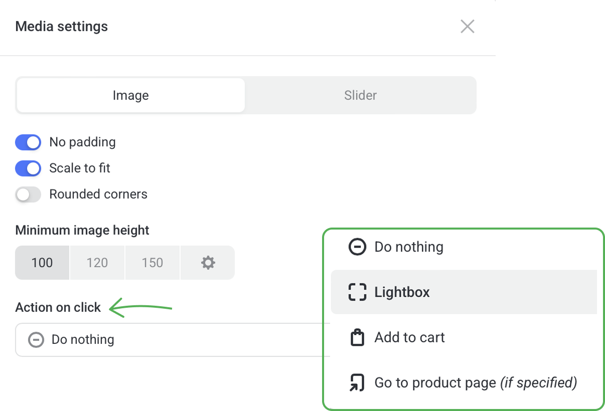
Image
Here you can set up the look of product images or slider.
You can also select the Action on click, i.e. what happens when a user clicks on the image.
Name
Set the font, color and padding around the product name.
Options
Set up the look the product options.
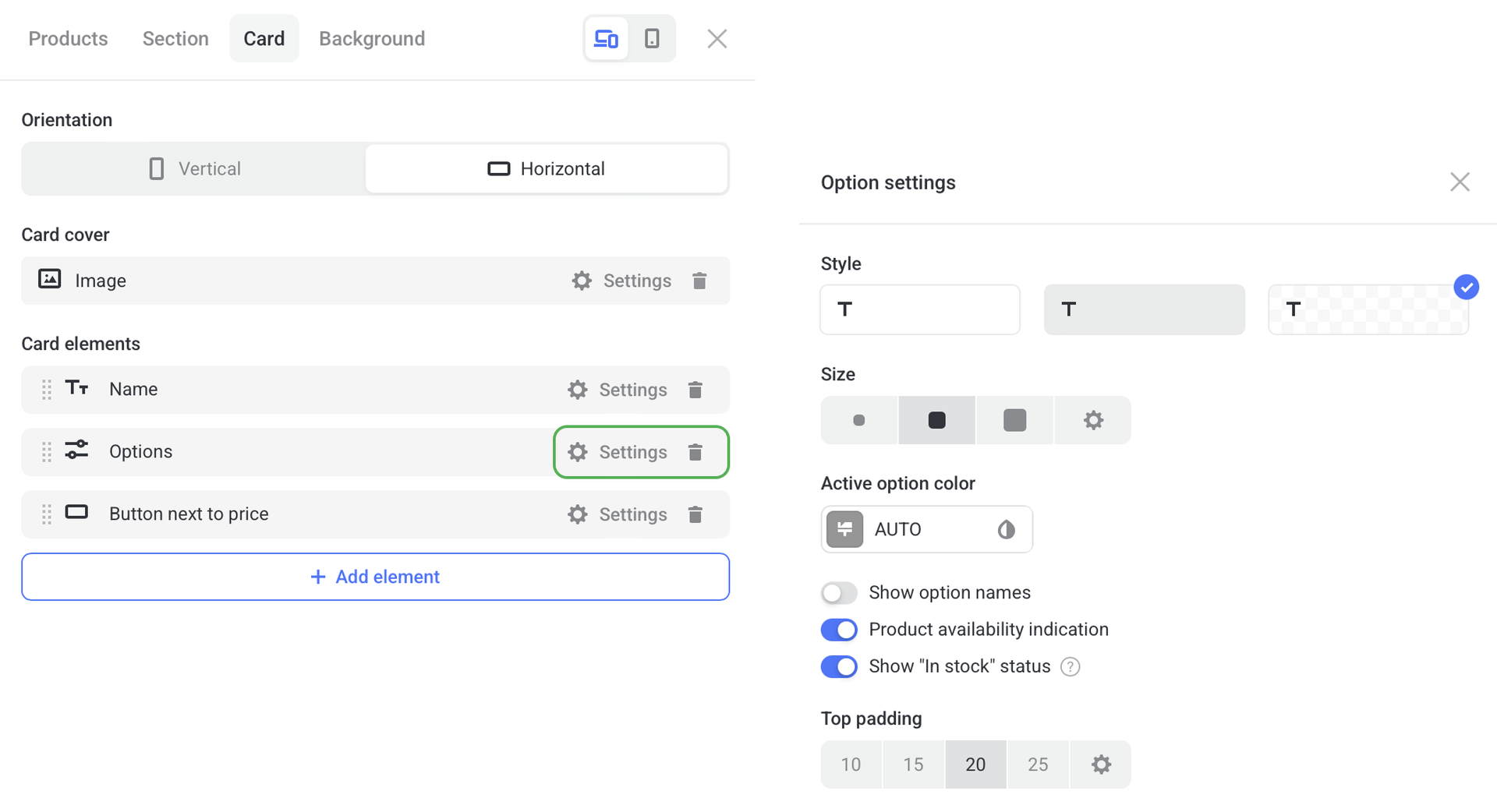
To make your product cards look minimalistic and clutter-free, hide displaying options in them.
To do this, remove Options from the card layout. In this case, product variants will appear in the pop-up when a product is added to the cart.
To show product variants in the card again, add Options to the Card layout.
More elements
Click + Add element to select more components for the product card: SKU, description, availability, price, etc. The selected element is added to all product cards in the section.
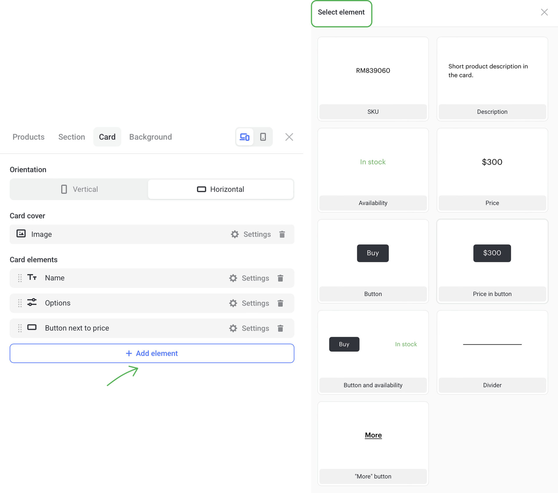
To customize any card element, click on the Settings to its right.
To delete any card element, click the trash icon to its right.
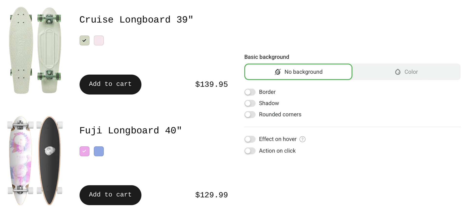
Basic background
By default, No background is set and product cards remain transparent.
To make product cards stand out, change their color. To do this, go to the Color tab, click Background color and choose one in the color picker.
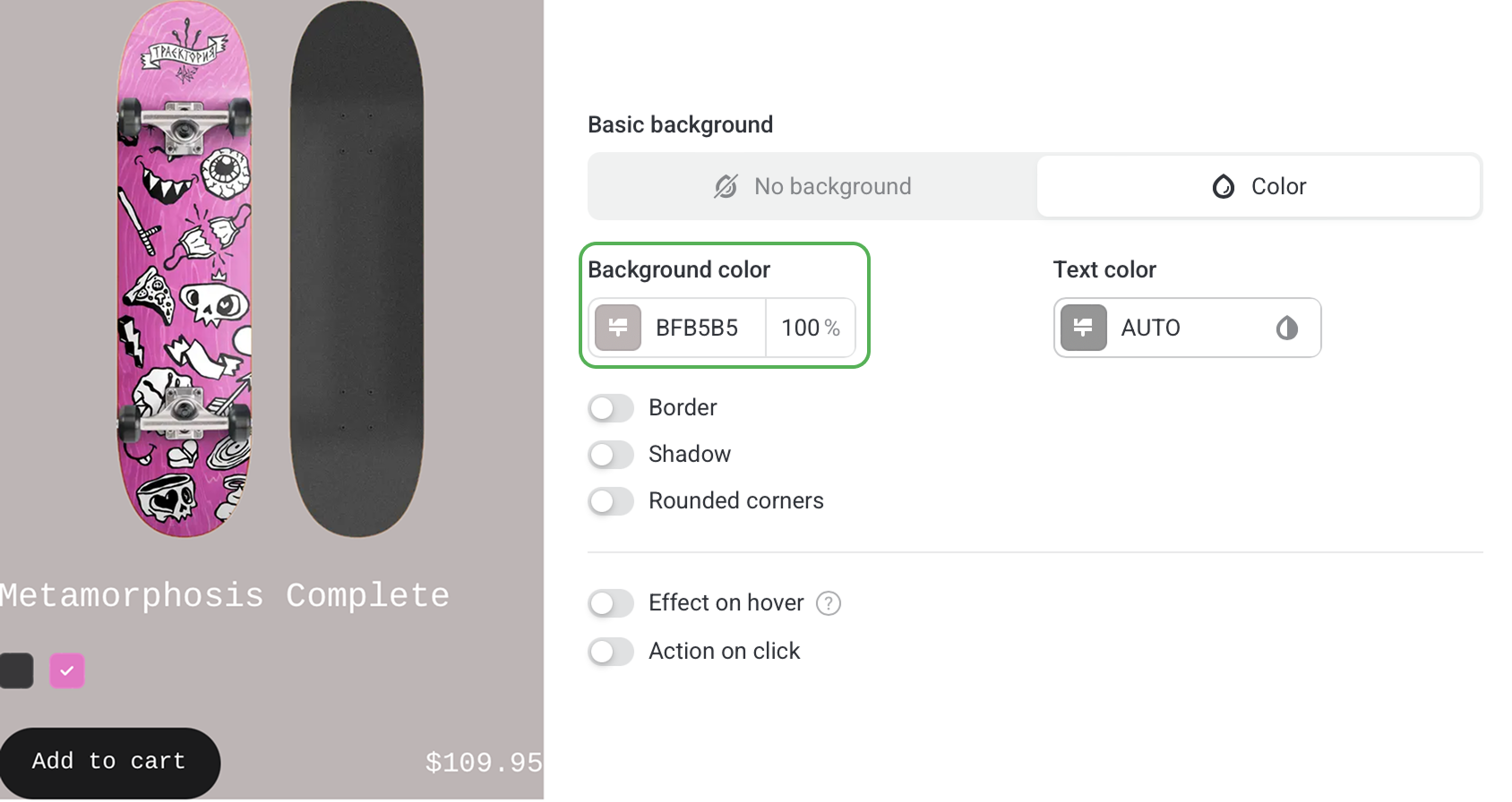
You can also set up padding, text alignment, effect on hover, and action on click — everything that affects the look of your product cards.