Setting up positioning
You need positioning to create free sections. It lets you control the position of elements on the canvas.
This makes your sections look the same across different devices with various viewports, for example, on 6.5 inch smartphones and 32 inch PC monitors.
You need to set up the section in such a way that its components would "stay put" across different devices, i.e. they would retain their position relative to each other.
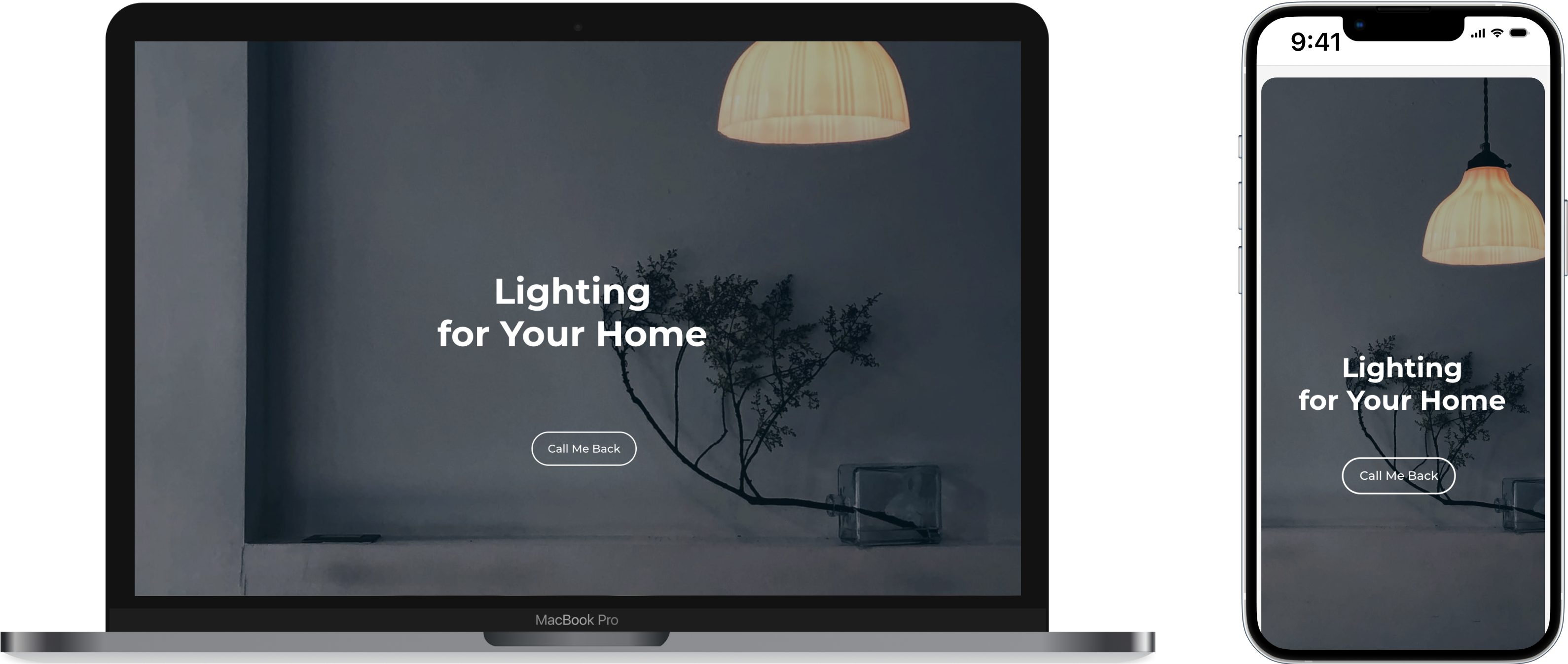
Positioning of elements in the standard sections is already set up for you. Positioning of elements in free sections depends entirely on your choice.
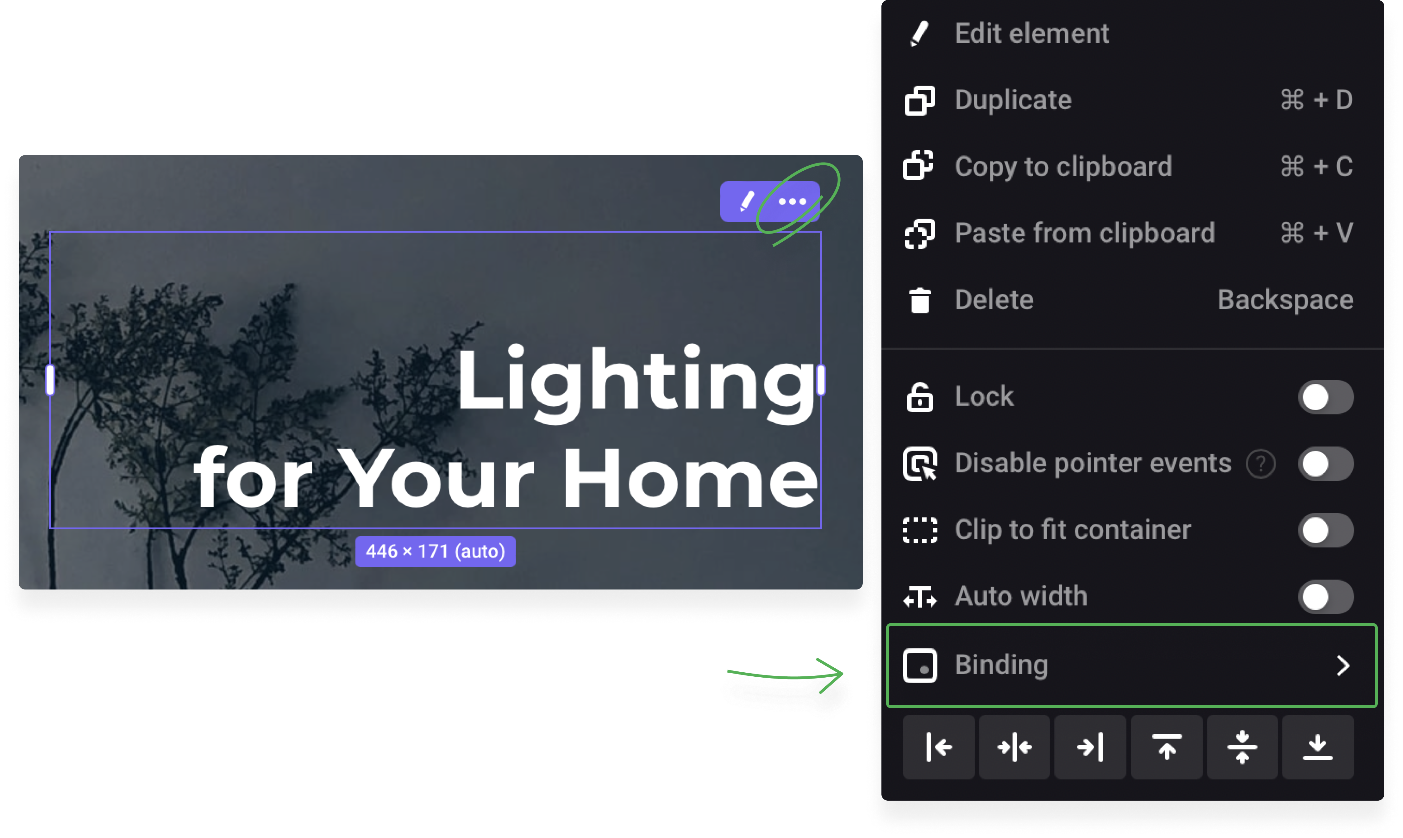
Dots for binding
Positioning of any element means binding it to one of the nine sectors in a section. Each dot for binding has its own pair of coordinates. An element gets different coordinates with each dot for binding you select.
There are no special recommendations on how to choose a dot for binding – consider solely your design needs.
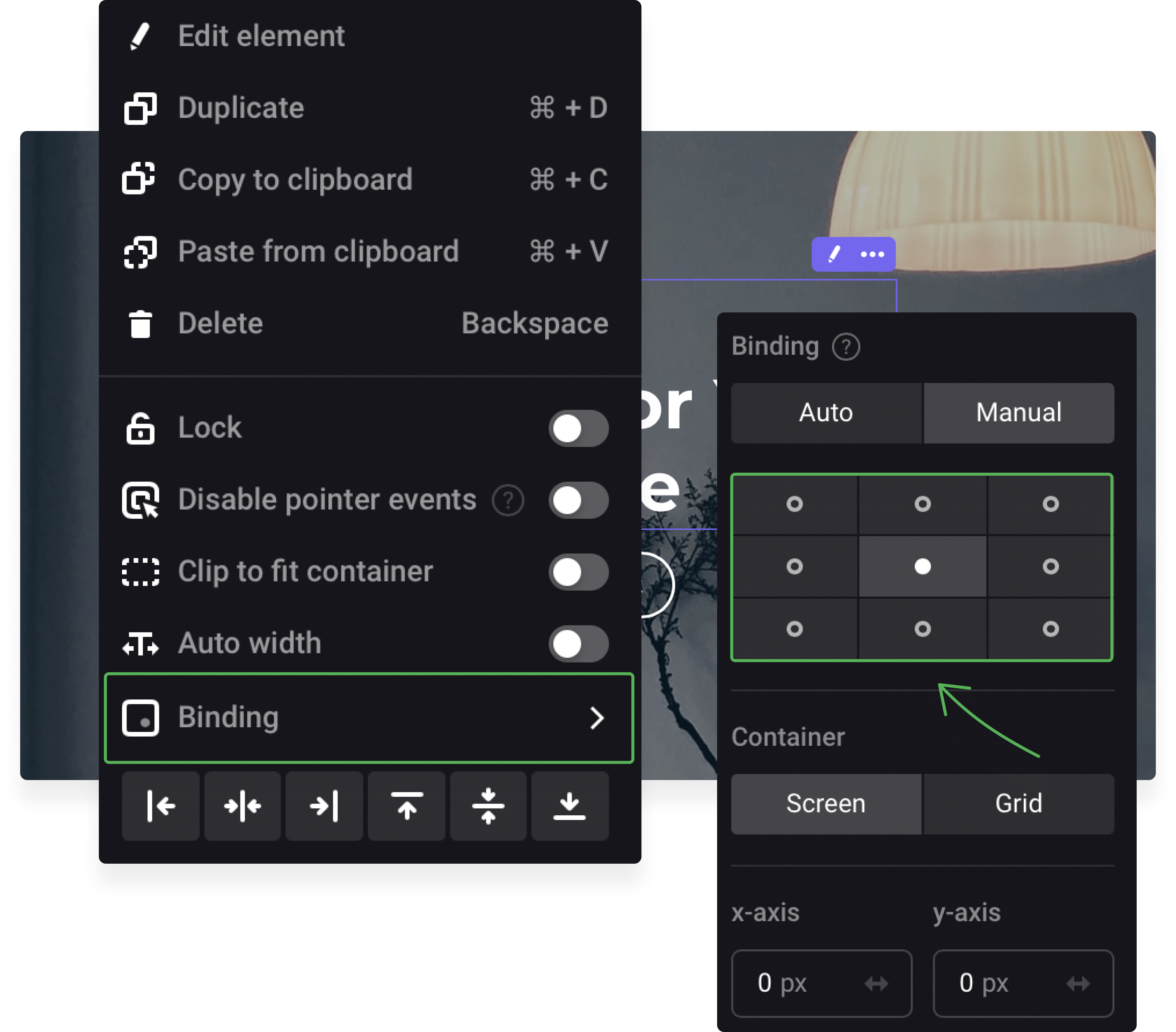
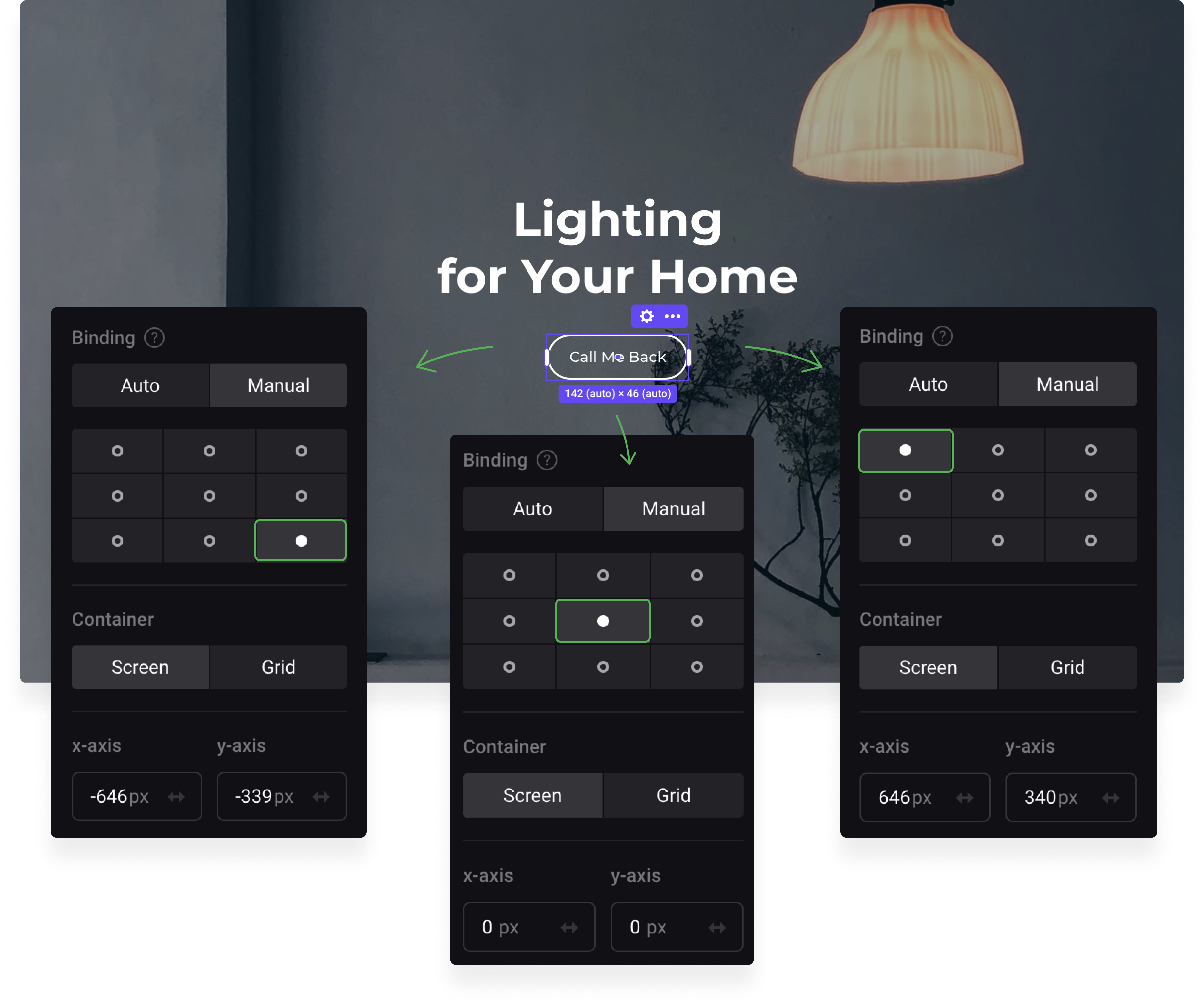
If you wish two elements to stay together across different viewports, then bind them manually to the same dot, for example, to the bottom right.

This positioning lets the button and heading stick together across different devices.

Now we'll bind the button to the center dot and the heading will remain bound to the bottom right.
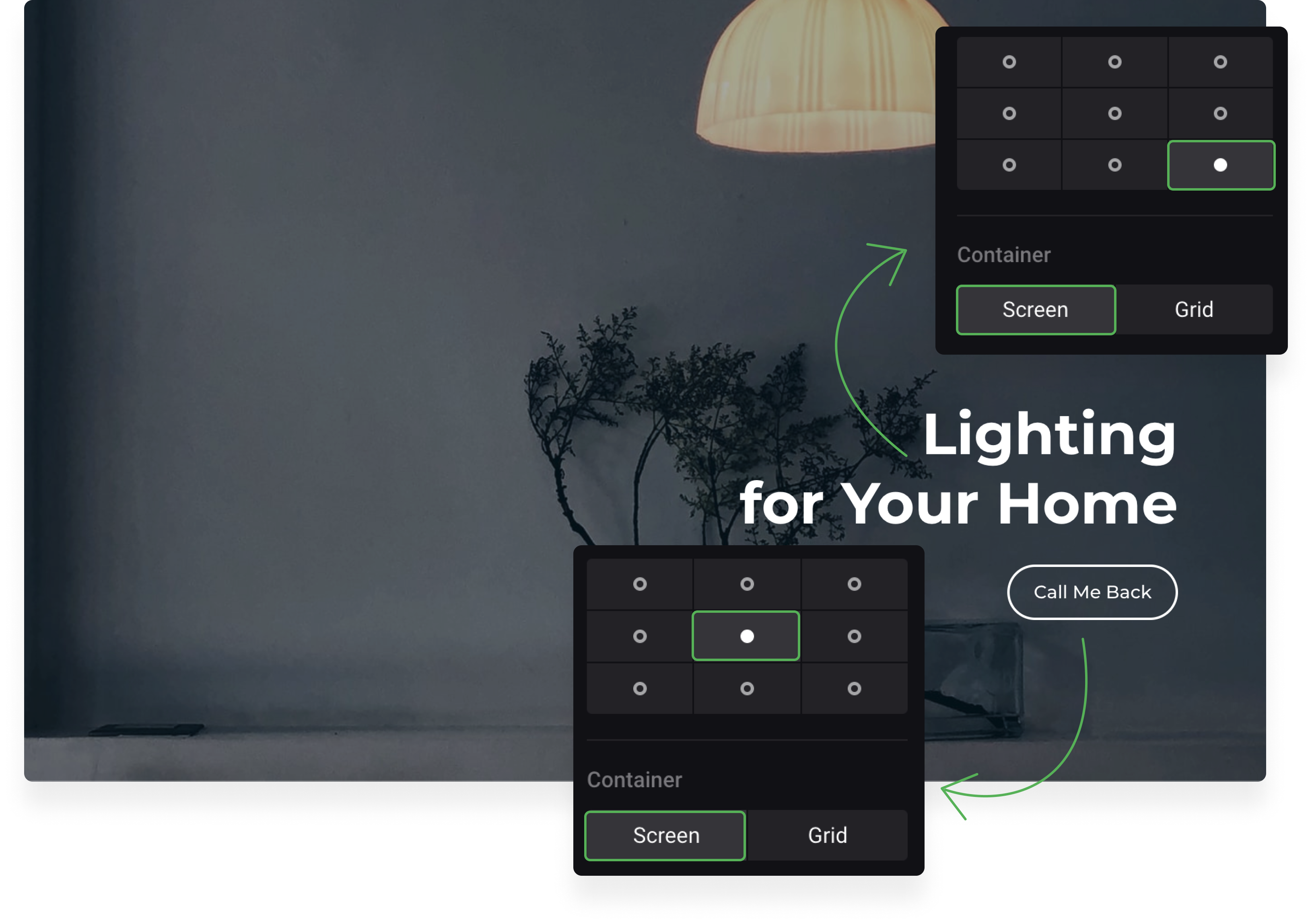
In this case, the button will overlay the heading on a 13 inch screen and significantly drift upwards on a 27 inch screen.

So, when you position elements, pay attention both to the dots for binding and to the placement of your elements in relation to each other.
To see how your site will look on different viewports, use zooming in/out of the display (press a combination of Ctrl and +/-- or Cmd and +/-).
Coordinates
Free sections use the coordinate system with x-axis for width and y-axis for height. Every element has a pair of defined coordinates.
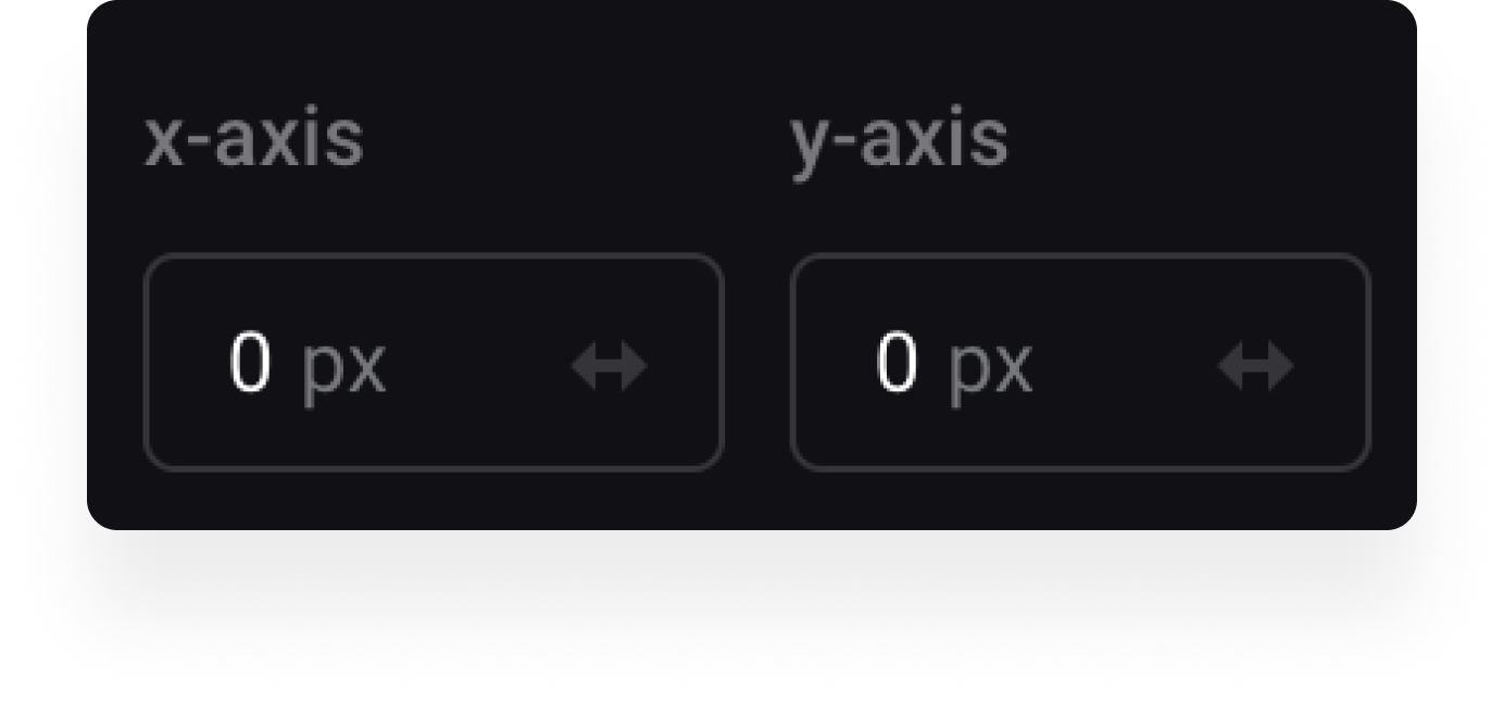
These coordinates depend on the dot for binding. For example, an element with the center dot for binding has 0/0 coordinates. If you choose another dot for binding but keep the same element positioning, then the coordinates of this element will change.
You can manually set up coordinates of an element. To center any element, you don't need to move it, just enter 0 as x- and y-values.
Types of binding
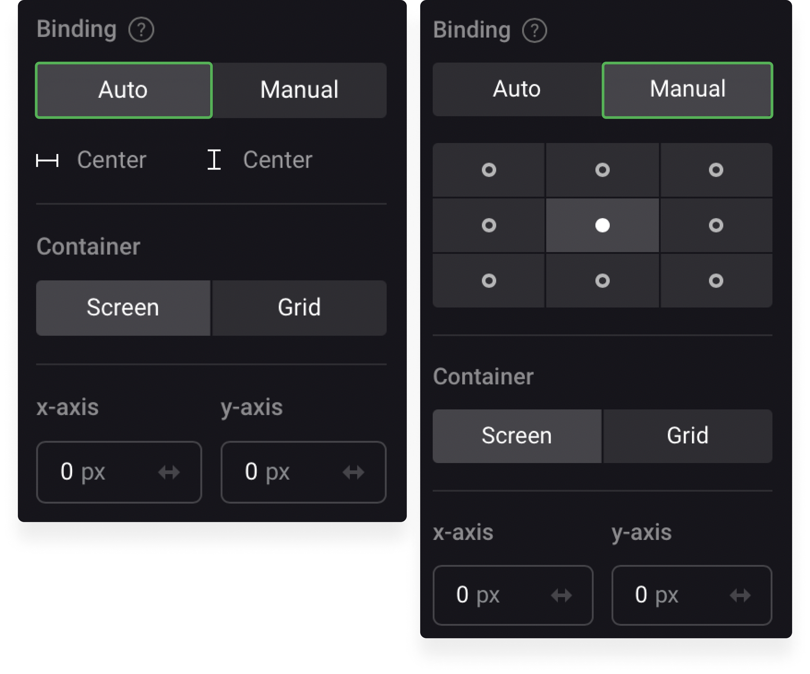
Manual binding
You choose one of the nine dots to bind your element.
Automatic binding
The algorithm defines the best dot for binding. Normally it's the dot nearest to your element.
Area of positioning
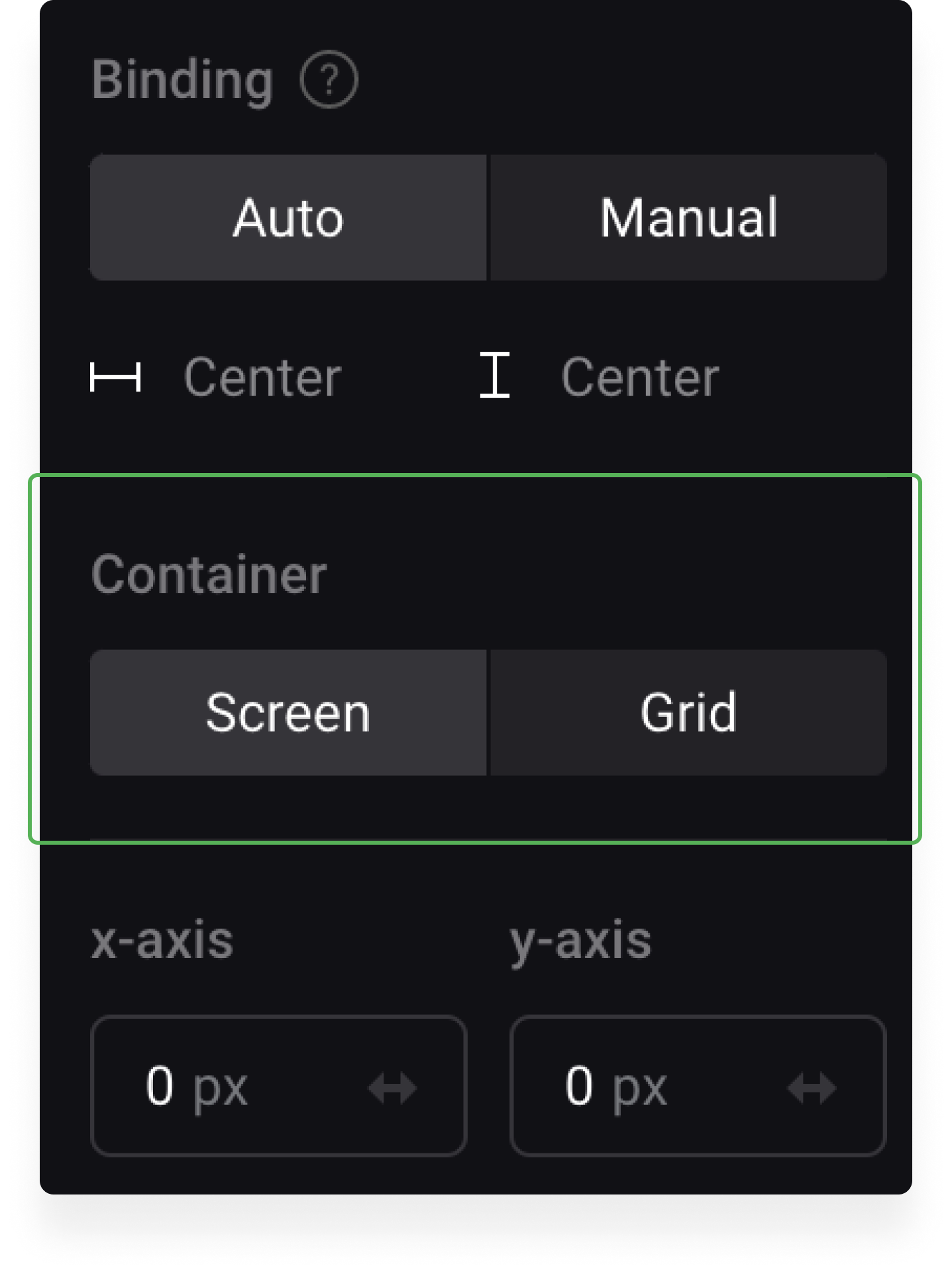
Container is the area of positioning; coordinates of any element are defined according to its container. This area can take up the whole screen or be limited to the grid only.
Grid is the container with a given minimum width of 1150 pixels and an unlimited height value.
The screen width can change, the grid is always 1150 pixels wide.
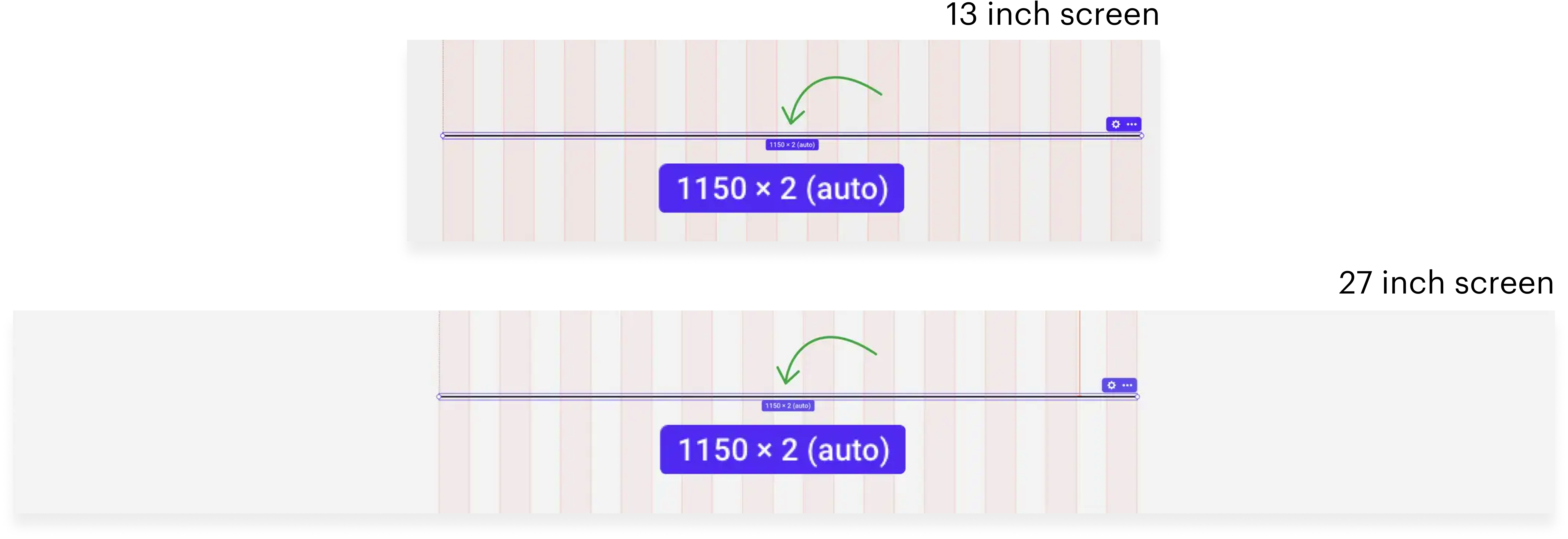
You should opt for positioning across the grid if you wish to keep the aspect ratio between elements. Even if the screen width changes, the elements will remain positioned across the x-axis with a well-defined width.
Select positioning across the screen if you want your content to stay in a specific place of the section (for example, always fixed to the right edge).

In this case, even if the screen size changes, the elements will remain positioned relatively to the corners or center of the display.