HTML form field
HTML field is a special type of field in the Form element that allows you to embed custom logic and interface using the features of the built-in code editor.
This field type comes in handy when you lack functionality of standard form fields. It helps you create custom fields, add hidden data to leads, validate data and fully control the behavior of fields.
What you can do using HTML fields
- create custom text fields, selects, masks, date pickers, tags, etc.;
- use native HTML attributes (
name,type,required,disabled); - use Flexbe system attributes (
data-check,data-mask,data-check); - insert JavaScript and manage form submission;
- use React components to design complex UI;
- add hidden fields to leads.
How an HTML field works
HTML fields allow you to run code in the form and create custom fields and interfaces (from simple HTML elements to complex React components with their own logic and state).
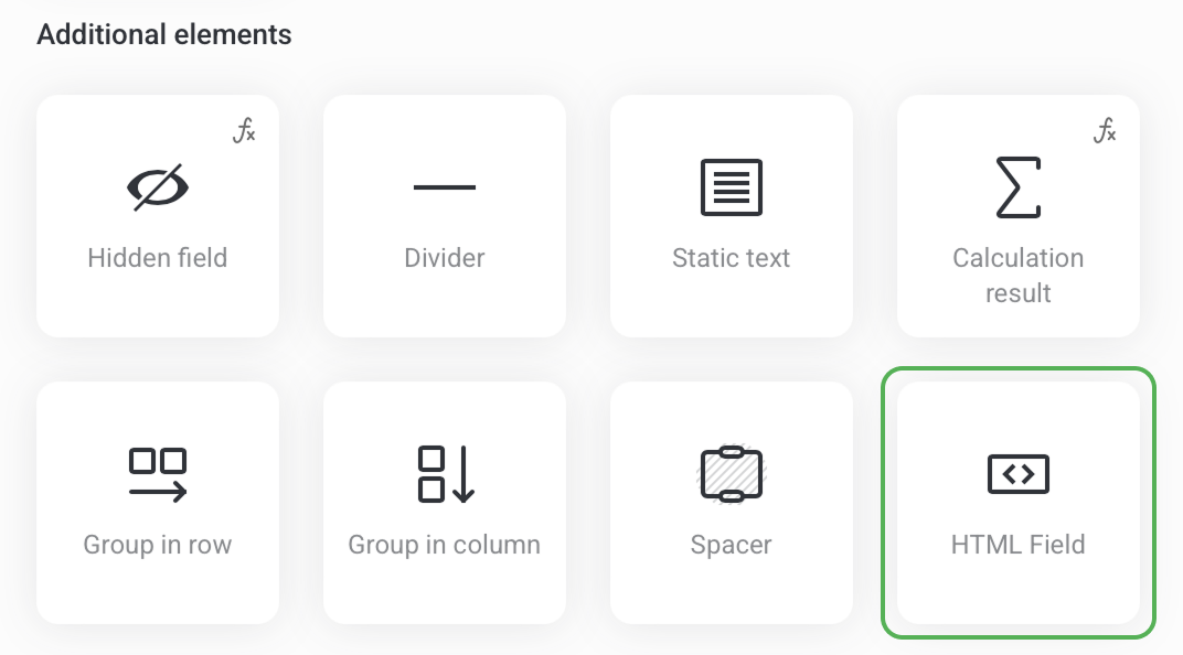
To create an HTML field on your page, first add a Form element. Then open the form settings and click Add field -> choose the HTML field in the list of Additional elements.
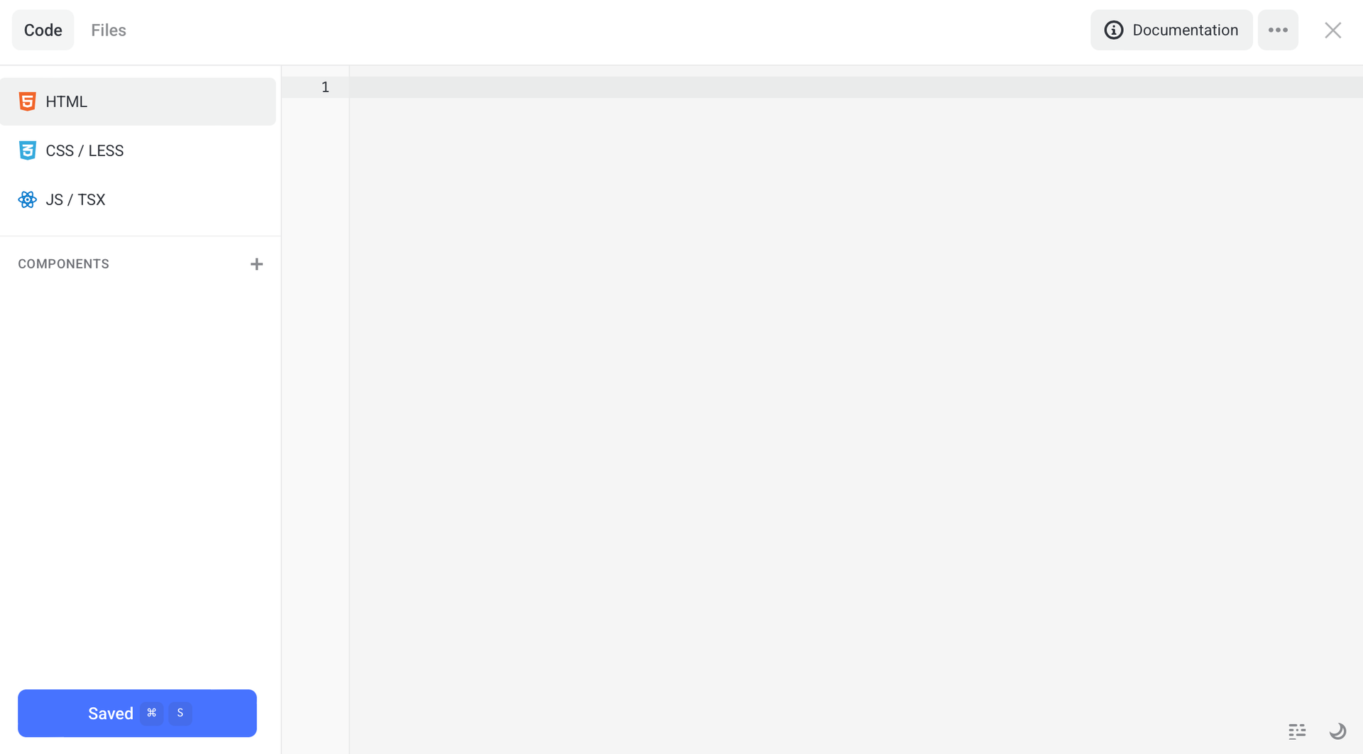
To open the editor, click Settings. The code editor is made of the following tabs:
- HTML -
index.html - CSS / LESS -
style.css - JS / TSX -
main.js
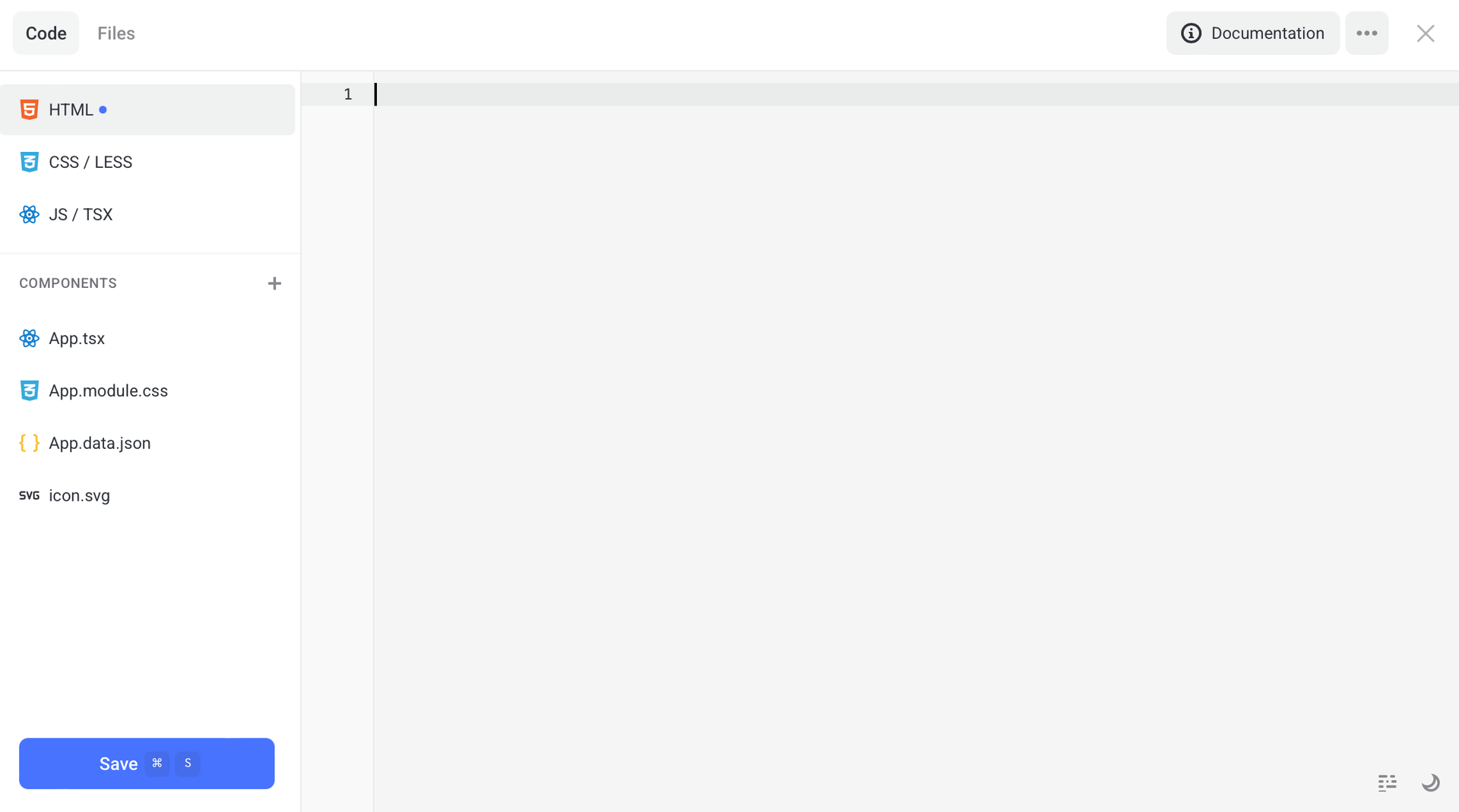
You can also use React and create components, store states, use hooks and connect module styles.
The example below includes:
index.tsx- component entry pointApp.tsx- main componentApp.module.cssor LESSApp.data.json- SVG (optional)
If you don’t need React, just leave the JS tab empty and add HTML markup and styles (as you see fit). HTML fields work fine both for simple and complex scenarios.
How to write custom code for your HTML field using AI
If you don’t know how to code, it’s not a problem anymore. Artificial intelligence does a great job of creating any HTML fields.
HTML fields require careful use of markup, classes, and attributes, and AI, like a professional developer, helps you quickly assemble the field you want.
Step-by-step instruction
- 1 Click the Copy instructions for AI button.
- 2 Paste the copied instruction to any AI.
- 3 Provide it with a simple description: which field you want to get and how it should work.
NOTEGenerate an HTML field for a form on Flexbe with a required email field, validation, mask and error output. Use form system classes.
- 4 Copy the resulting code from AI.
- 5 Paste it to the code editor of your HTML field.
-
 Enjoy!
NOTEIf needed, tweak the resulting code to fit your logic.
Working with the form JS API
You can interact with forms using the formApi object found on the JS / TSX tab of your HTML field.
This API allows you:
- to get access to DOM nodes of the form and its fields;
- sign up for submission and error events;
- add additional data to the leads;
- control the Submit button;
- clear forms and their error.
Properties of formApi
| Property | Type | Description |
|---|---|---|
| formApi.fields | HTMLElement[] | All visible form fields (added in the editor) |
| formApi.field | HTMLElement | DOM node of a current HTML field |
| formApi.form | HTMLFormElement | DOM node of a form |
| formApi.button | HTMLButtonElement | DOM node of a Submit button |
| formApi.isSubmitDisabled | boolean | If submission is blocked |
Methods of formApi
| Method | Arguments | Description |
|---|---|---|
| formApi.setFields(fields) | Field | Adds virtual fields to leads. Learn more |
| formApi.resetFields() | — | Deletes all virtual fields added through setFields |
| formApi.submit() | — | Programmatically submits a form |
| formApi.resetForm() | — | Totally clears a form |
| formApi.resetErrors() | — | Resets validation errors |
| formApi.disableSubmit(message?) | string? | Blocks submission and shows a hint with the submitted messages when a user is trying to press the button |
| formApi.enableSubmit() | — | Unblocks the Submit button |
| formApi.validateForm() | – | Starts validation of standard form fields. It returns true if there are no errors, or false if one of the form fields is invalid. Learn more |
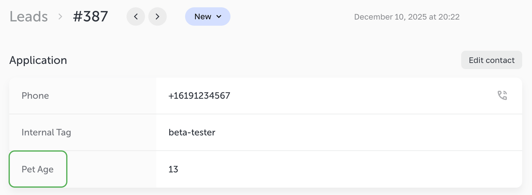
How setFields() method works
This method is used to add invisible fields,that are transferred to a lead together with the standard fields.
Code
formApi.setFields([
 { name: 'Internal Tag', value: 'beta-tester', type: 'text' },
 { name: 'Pet Age', value: '13', type: 'number' }
]);
After the form submission these fields appear in the lead, connected integrations and notification emails.
Field object format
Code
type Field = {
 name: string; // required field name (displayed in the lead)
 value: string; // a value that is transferred into a lead
 type?: string; // (optional) field type (identical to the type described in “Type and data-type attributes" in this article)
};
How validateForm() method works
The method forces a check of all standard form fields (i.e., all the fields that a user added to the Form element).
It comes in handy if you prevent form submission in the submit event, and you want to validate standard fields (display errors) before allowing the submission.
The method returns:
true- if there are no errors, the form is valid.false- if there are errors in the standard form fields.
Standard use logic
Code
formApi.on('submit', (e) => {
 const baseFieldsValid = formApi.validateForm(); // validation of standard fields
 const customFieldsValid = validateCustomFieldsSomehow(); // validation of HTML fields

 if (!baseFieldsValid || !customFieldsValid) {
   // there are errors – prevent form submission
   return false; // or e.preventDefault()
 }

 // everything is OK — the form continues standard submission
});NOTEIf you don’t prevent submission, the form checks the standard fields automatically while submission. The method comes in handy for cases when you intercept
submitand you want to start in-build validation manually.
Form events
You can subscribe to form events to react to submissions, errors or to modify its behavior.
Before form submission
Code
formApi.on('submit', (e) => {
 // Your code before submission
 // return false or e.preventDefault() cancels submission
});
It is used:
- to run additional check of values;
- to dynamically add data using
setFields; - to prevent submission.
After successful form submission
Code
formApi.on('submitted', (e, result) => {
 // Your code after submission
 // return false or e.preventDefault() cancels submission
});
It is used to display messages, reset states, and clear UI. By returning false or calling e.preventDefault(), you can fully override the platform standard behavior.
This way, after form submission you can prevent:
- clearing all form fields;
- executing the action selected in the interface, such as Open pop-up, Follow the link, Call;
- any other default behavior.
When a form submission error occurs
The requestError event fires if an error occurs while submitting a form, for example, due to network issues or server errors. You can use the event handler to display an error message to the user or run your own fallback logic.
Code
Input field attributes
The HTML field supports Flexbe’s built-in functionality,including field validation, input masks and service attributes.
You can control field behavior using attributes like required, data-check, data-mask, type, data-type, name, data-name, etc., and the form will correctly apply them during data entry and submission.
NOTEIf you’re using third-party scripts/widgets that modify your form field, by adding data-* or changing their name/type), then this may affect which field names and types are sent to the leads/integrations.
Be sure to test the result with test submissions after embedding any third-party code.
`name` and `data-name` attributes
name - It’s any text that is sent to a lead as the field label.data-name - It’s an optional attribute that allows overriding field labels in the lead. It must be used only together with the name attribute.
NOTEIf the
nameattribute is not specified, the field value won’t be sent to the lead.
Code
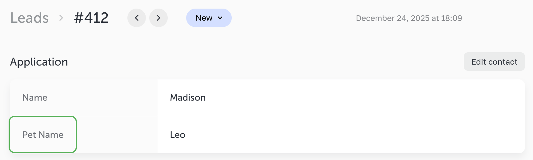
If a site’s visitor enters Leo in the HTML field, then the lead will look as follows:
The name attribute determines how the field will appear in the leads, integrations and notification emails.
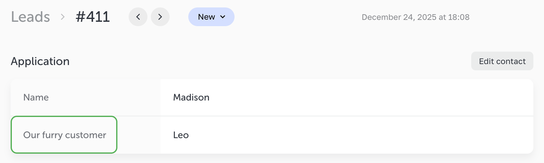
If the field includes both data-name and name attributes,
then the data-name attribute will be used as the field label, and the name attribute will be ignored.
When to use `data-name` attribute
Use data-name if you need to:
- dynamically change the field label in the lead;
- set a display name that differs from the technical
name; - manage field labels in the HTML fields or custom logic.
In all other cases, we recommend using only the name attribute.
`type` and `data-type` attributes
The type attribute affects the browser’s native behavior.
The data-type attribute affects the way your field appears in the leads, integrations and notification emails.
The list of supported types matches those available for native and HTML fields (except for name):
- name - a contact name in the lead;
- text — a plain text line;
- email — an email address;
- tel — a phone number (it is displayed with a handset icon);
- number — numerical values;
- date — a date;
- datetime — a date and time. Use
type="datetime-local"for this type;data-type="datetime"is used to display in leads. The validator is not used because the platform has a separate calendar format.
NOTEIf the
data-typeattribute is not specified, thetypeattribute is used by default.If the
typeattribute is not specified, then thetextattribute is used by default.
Code
It's a text field that serves as a field label in the leads.
It’s a text field with a custom validation of digits, but it appears as a number in the leads.
A non-standard contact field
It’s a text field in the form but, in the lead, it appears as a phone number.
You can find a comprehensive list of standard types for thetype attribute supported in the HTML form fields attribute values here.
`required` attribute
The required attribute makes any field mandatory. If such a field is empty, the form won’t be submitted until the visitor fills in the field.
To display an error message, add an element with the .error class. It will be automatically shown or hidden depending on the field state.
Inside it, place the element with the .error-text class then the platform will insert a default error message there.
Code
<input
 type="text"
 name="Enter your name"
 required
/>

<div class="error">
 <span class="error-text"></span>
</div>
You can also display a custom error message instead of the default one. To do this, insert your message directly inside the element with the .error class, without using the .error-text element.
In this case, the system will skip the default error message and display only your custom one.
Code
<input
 type="text"
 name="Enter your name"
 required
/>

<div class="error">
 Enter your custom error message here
</div>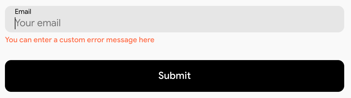
`disabled` attribute
If a field is marked as disabled, it won’t be sent to the lead (standard HTML form behavior).
`data-check` attribute
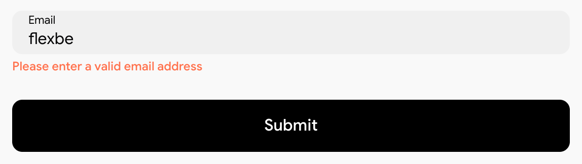
The data-check attribute enables Flexbe’s built-in form validation.
Depending on the entered value, the platform automatically checks whether the input is valid.
Supported validation types
- email - standard email format validation
- phone - checks that only digits are entered and a minimum length is met
- file - checks that a required file is downloaded successfully
- date - validates the selected date using the built-in calendar
- datetime - validates the selected date and time using the calendar
Code
<input
 class="form-field-text__input"
 type="email"
 data-check="email"
 placeholder="example@gmail.com"
 name="Email address"
/><input
class="form-field-text__input"
type="text"
data-check="phone"
placeholder="+7 911 123 4567"
name="Phone"
/>`data-mask` attribute
This attribute allows you to add simple input masks:
Code
Recommended field HTML structure
Using system classes allows HTML fields to automatically inherit the styles configured on the Style tab in the form settings.
Code
<div class="form-field-text">
 <div class="form-field-text__wrap">
   <div class="form-field-title">Enter your SSN</div>
   <div class="form-field-input__wrap">
     <input
       class="form-field-text__input"
       type="text"
       name="User data"
       data-mask="###-##-####"
     />
   </div>
 </div>

 <div class="error">
   <span class="error-text"></span>
 </div>
</div>
An example of a simple HTML field
In the example below, the field is configured to verify the input against an email format, while still relying on the default form field styles.
Code
<div class="form-field-text">
 <div class="form-field-text__wrap">
   <div class="form-field-title">Email for notifications</div>

   <div class="form-field-input__wrap">
     <input
       class="form-field-text__input"
       type="email"
       name="Email for notifications"
       data-check="email"
       required
       placeholder="example@gmail.com"
     />
   </div>
 </div>

 <div class="error">
   <span class="error-text"></span>
 </div>
</div>
An example of an HTML field built with React
The following example shows how, using React, to build a dynamic tag selector. It supports state toggling, collects selected tag values into a structured format, and sends them into the leading using the setFields() method.
The implemented logic allows users to select multiple tags at once.
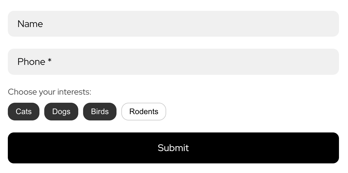
This way the submitted values will appear in the leads.

All selected values are combined into a single string and sent to the lead using the formApi.setFields() method.
index.tsx
import { createRoot } from 'react-dom/client';
import App from './App';

declare const formApi: any;

createRoot(formApi.field).render(<App />);
App.tsx
import React, { useState, useEffect } from 'react';
import styles from './App.module.css';

declare const formApi: any;

const ALL_TAGS = ['Dogs', 'Cats', 'Birds', 'Rodents'];

export default function App() {
 const [selected, setSelected] = useState<string[]>([]);

 // The field is sent to the lead
 useEffect(() => {
   formApi.setFields([
     {
       name: 'Customer’s interests',
       value: selected.join(', '),
       type: 'text'
     }
   ]);
 }, [selected]);

 const toggle = (tag: string) => {
   setSelected((prev) =>
     prev.includes(tag)
       ? prev.filter((x) => x !== tag)
       : [...prev, tag]
   );
 };

 return (
   <div className={styles.wrapper}>
     <div className={styles.title}>Choose your interest(s):</div>

     <div className={styles.tags}>
       {ALL_TAGS.map((tag) => (
         <button
           key={tag}
           type="button"
           className={
             selected.includes(tag)
               ? styles.tagSelected
               : styles.tag
           }
           onClick={() => toggle(tag)}
         >
           {tag}
         </button>
       ))}
     </div>
   </div>
 );
}
App.module.css
.wrapper {
 display: flex;
 flex-direction: column;
 gap: 10px;
}

.title {
 font-size: 14px;
 color: #444;
}

.tags {
 display: flex;
 flex-wrap: wrap;
 gap: 8px;
}

.tag {
 padding: 6px 12px;
 border-radius: 12px;
 font-size: 13px;
 cursor: pointer;
 border: 1px solid #ccc;
 background: #fff;
 color: #000;
}

.tagSelected {
 background: #333;
 color: #fff;
 border-color: #333;
}