Top don'ts of designing a site
Get ready for an unforgettable immersion into the universe of loud colors and flickering sliders. Made by professionals. Don't try this at home!
Mistake #1. Don’t add multicolored backgrounds with loads of effects
An abstract minimalist background image catches the eye on the section. Colorful low-resolution background images stretched across the screen make you cry. We highly recommend against using images with words as it distracts attention from the main copy.
Mistake #2. Don’t take more than two fonts
If you take more than two fonts, sections will look like an oriental rug. It’s pretty hard to match even two fonts harmoniously – to say nothing of three or four.
Mistake #3. Don’t use fantasy fonts as your base fonts
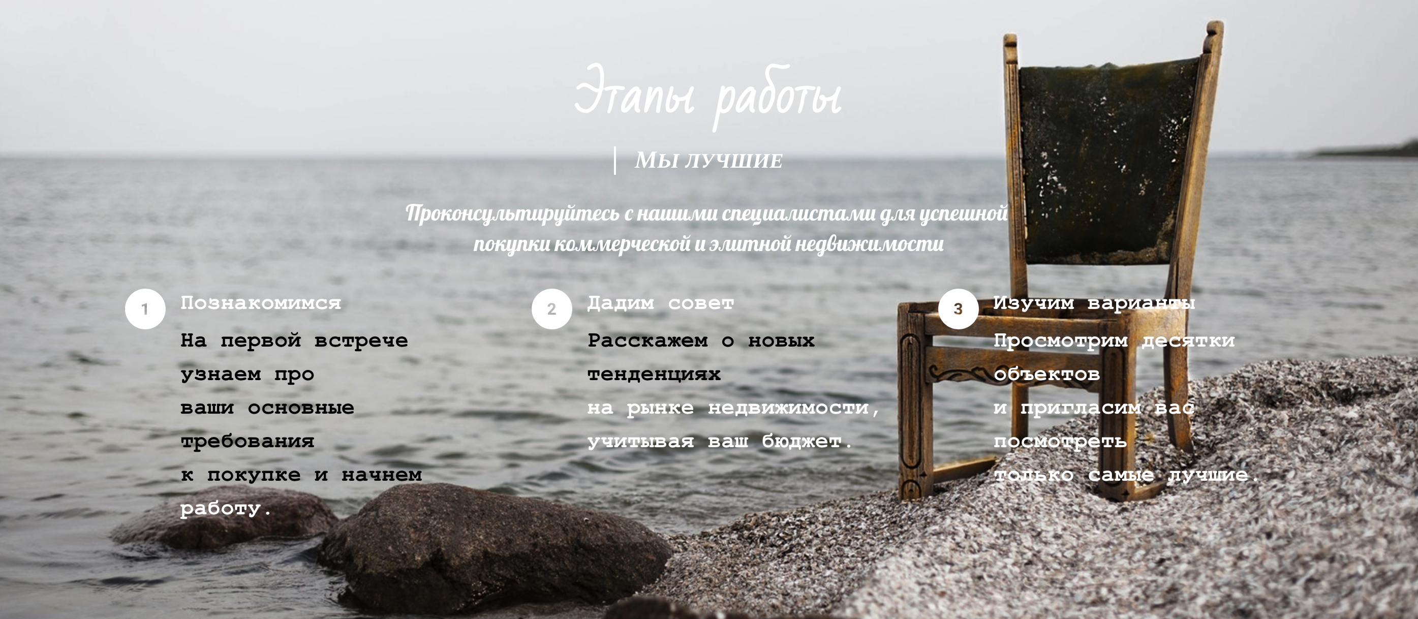
Choose fonts that are "easy to read". If a font looks awesome but letters are totally illegible, especially small ones, especially on the background — give up this creative urge and take classical fonts (such as PT Sans).
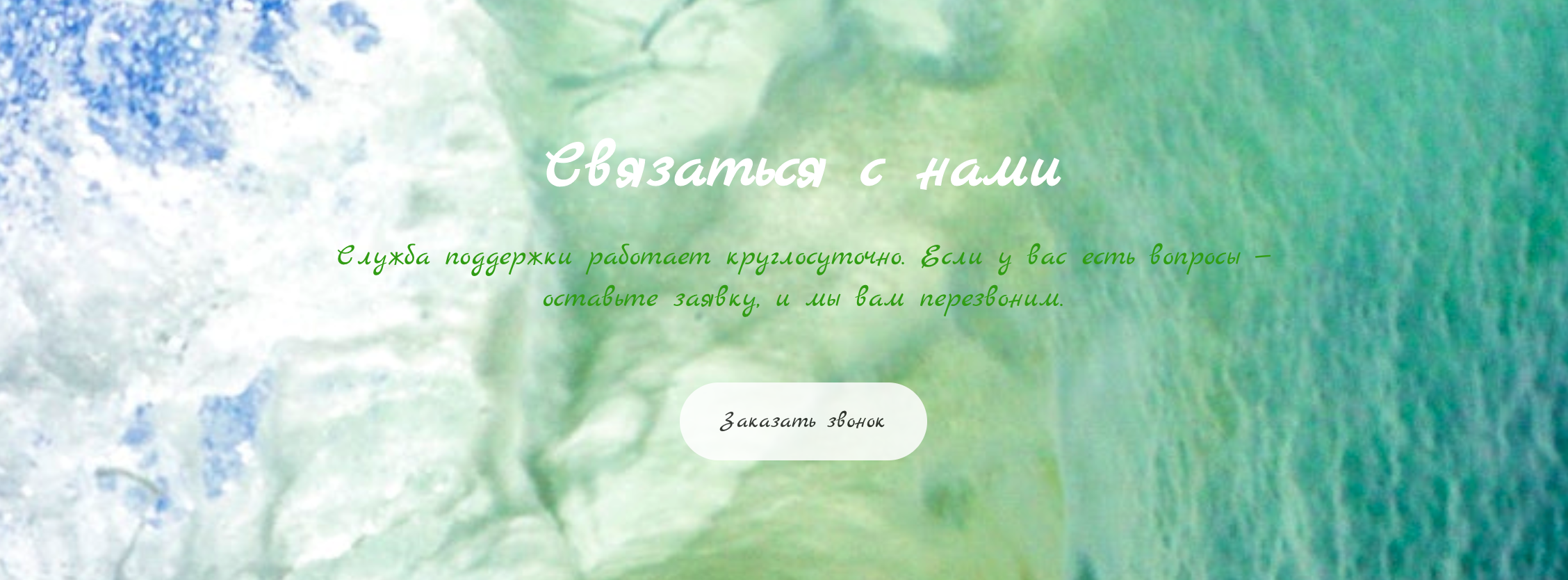
Mistake #4. Don’t upload images with the poor contrast ration between text and background
When you upload a colorful photo, it makes the copy hard to see in different parts of the screen. There are such images where you can see white letters in one part of the photo and black letters — in the other. Regardless of the chosen font color, some text chunks get invisible or unreadable.
If you are eager to upload a multicolored image, use Fading in the Layout settings.
Mistake #5. Don't forget about minimum indents between sections
When sections are visually cluttered together, it’s hard to make out where one section ends and another starts. Such layouts look unprofessional and is illegible. Experiment with indent values of top and bottom section borders to find the optimum (20px is default minimum).
Mistake #6. Don’t add two headers
It’s a common mistake to add one header right after another. It looks cumbersome and unreasonable. Just use the option Enable second row in header to add any elements that you can’t fit into one header row.
Mistake #7. Don’t overdue with colors, styles and effects
Do not bombard your visitors with different button styles, colorful text chunks, numerous background effects and tons of elements — they will definitely want to unsee that motley crew.
People usually add loads of bright elements to grab the prospective customers' attention. Their attention will be caught, but it will be impossible to see the main point of a section that is glittering like a Christmas tree.
С 15 по 21 апреля
пройдет курс
по выпечке тортов
ТОРТ ЭТО ЯЗЫК ЛЮБВИ
Mistake #8. Don’t use several sliders with automatic slideshow
If you need several sliders on the page, do not use automatic slideshow. Firstly, browsers can’t start all sliders at the same time — they move uncoordinatedly. Secondly, images are flashing on the screen, and it is impossible to focus on one particular photo.
Site visitors can flick at their own pace and examine images as they see fit. This is what product sliders are for.
You’ve learnt about eight common mistakes of building a website. Learn about the most typical mistakes that beginners make while creating their first screen fold.
