Homepage: beginners' mistakes to avoid
We’ve gathered 4 most common mistakes that beginners make designing the first fold of a page. Examples below can serve as vivid illustrations.
Learn from the mistakes of others to create an awesome homepage.
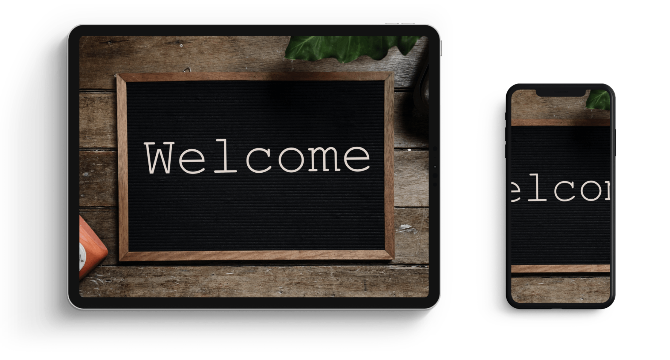
Mistake #1. Don’t use images with words
Why not
Photos are cut off on mobile devices so people will see only parts of an image.
Moreover, later you will be unable to alter the text without replacing the whole image.
Any text that is part of an image is not indexed by search engines so prospective customers will simply be unable to find your site.
Solution
Upload images first, then add Title or Text elements. In this case your design will adapt automatically to the screen size and pages will be displayed correctly on various devices.
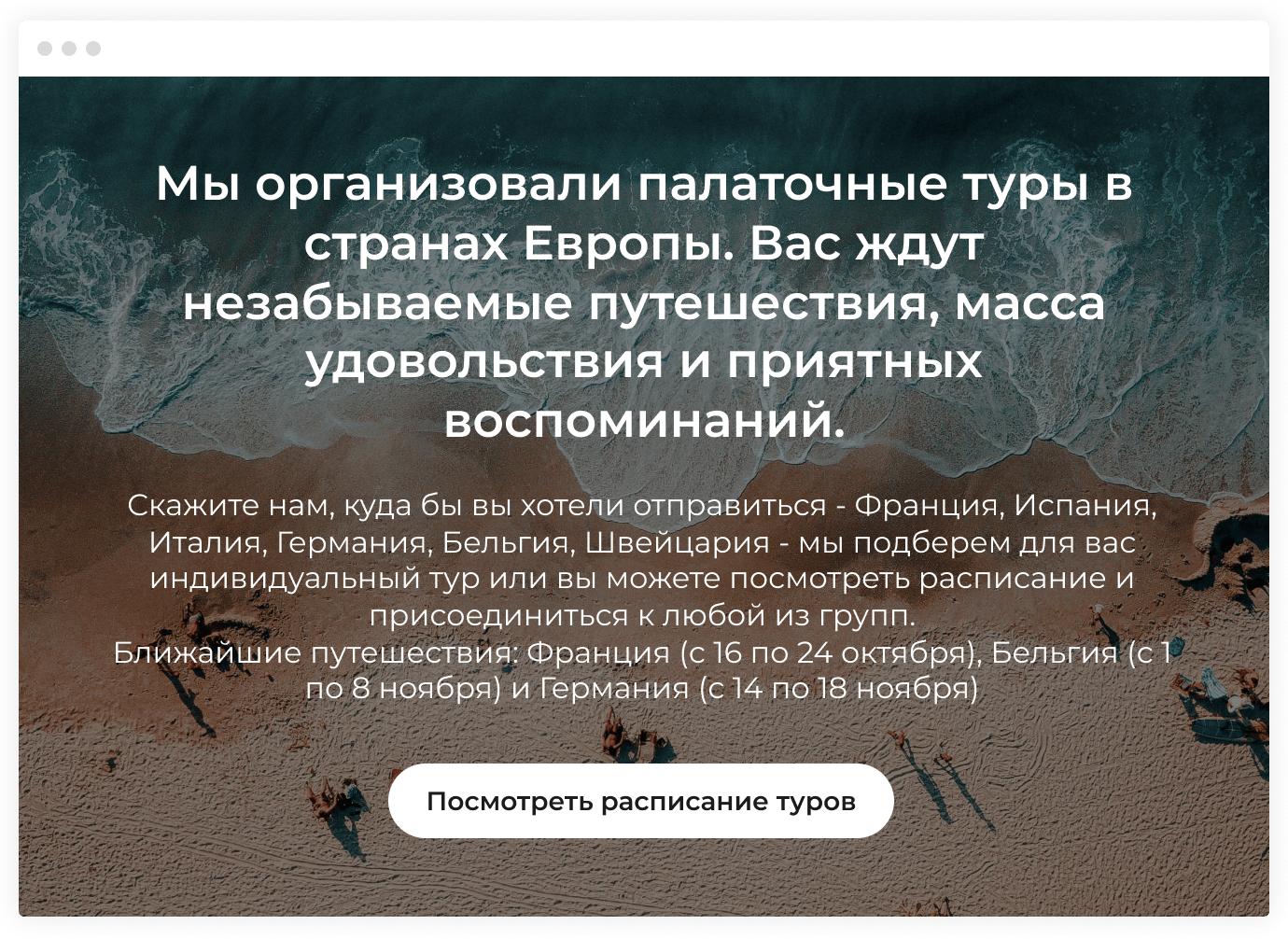
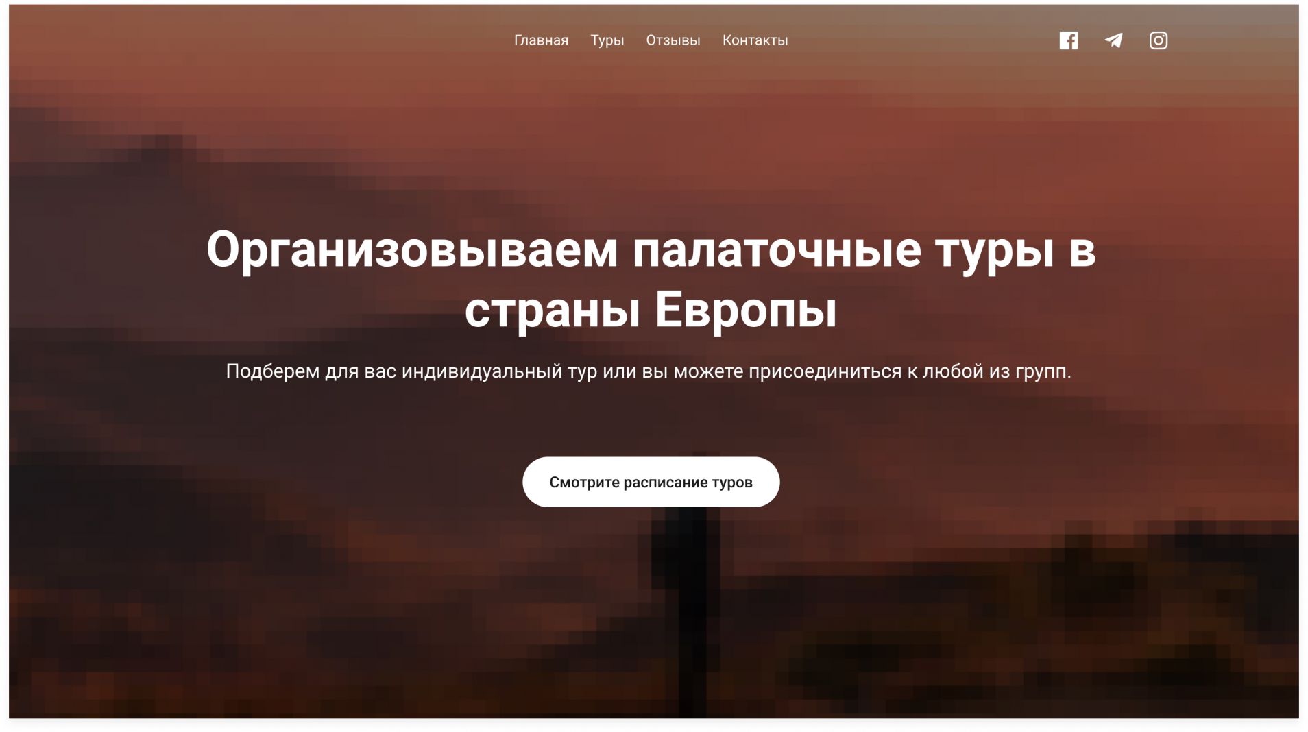
Mistake #2. Don’t overload the first fold with text
We've Organized Camping Tours to the European Countries. Get Ready to Experience Unforgettable Adventures, a Whale of Time and Pleasant Memories.
Tell us where you would like to go: France, Spain, Italy, Germany, Belgium - we'll pick a personalized tour for you. You are welcome to choose one of the several schedule options and join any group.
Upcoming tours: France (June, 16-24), Belgium (July, 1-8) and Germany (July, 14-18)
See Tour Schedule
Why not
Too much information engulfs the reader and washes away their ability to think.

When there’s too much text, visitors can’t see the main point and your offer simply gets lost.
A long copy takes up several screen folds in the mobile version. Who wants to waste their time on reading?
The first page fold should have a call-to-action (CAT). If you don’t focus all attention on it, visitors won’t perform a desired actions but only read the copy instead.
Solution
Organized Camping Tours to the European Countries
We will pick a personalized tour for you or you are welcome to join any group.
See Tour Schedule
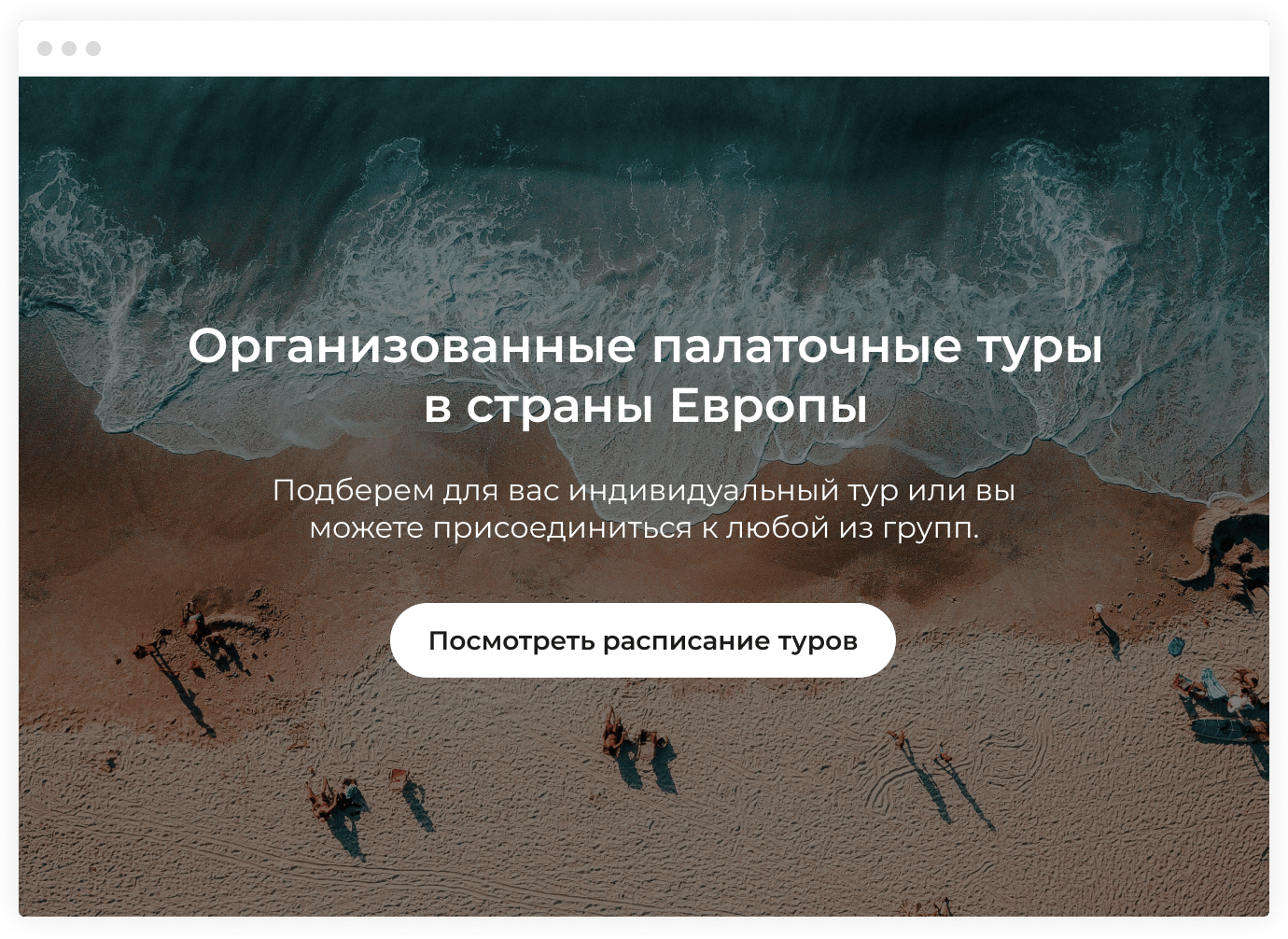
Write a concise headline that tells who you are and what you’re offering. Add a CAT, a couple of clarifying lines and move on to other sections.
Too much information diverts attention from the call-to-action. Moreover, long copies are cut off on mobile devices, probably even before reaching the CAT.
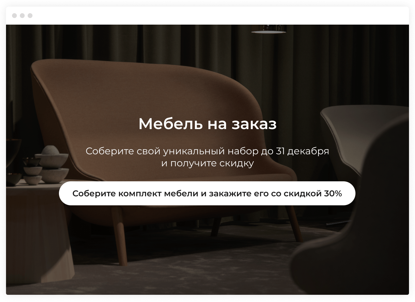
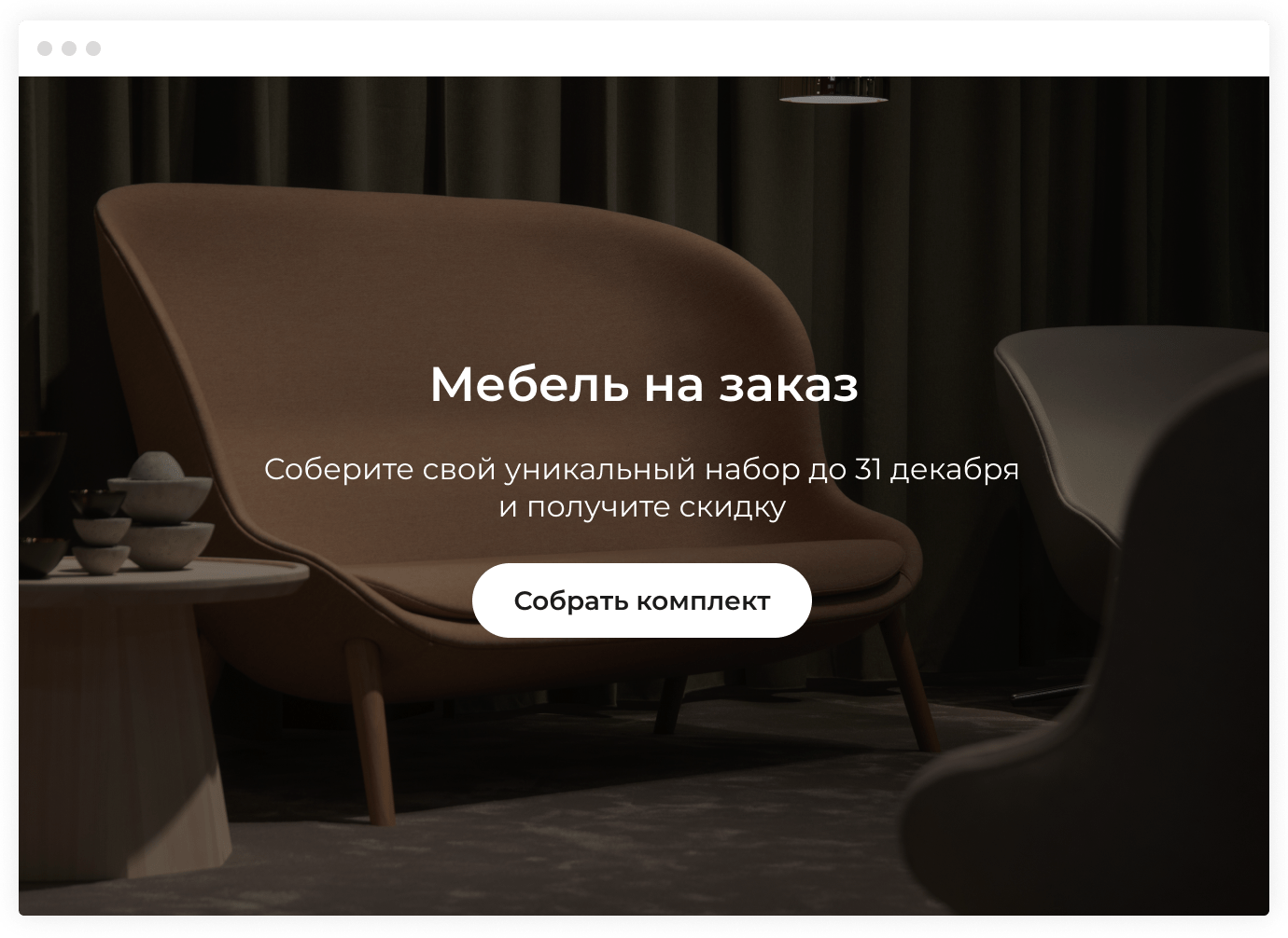
Mistake #3. Don’t write to much text on the button
Custom-Made Furniture
Choose your unique set till December, 31 and get a discount
Choose a set of furniture and order it with 30% OFF
Why not
Too many words shift focus from the action. Moreover, long phrases are cut off in the mobile version of your site, perhaps even before reaching the point.
No call-to-action means that visitors won’t understand the benefits of clicking on the button.
If there are several CATs in one button, it’s unclear what exactly will happen after the click.
Solution
A button is the place where you meet your prospecitve customers. It should contain an explicit call-to-action (between one and three words). Concise. Clear. With an action verb. We recommend using not more than 25 characters in one button.
Highlight the button with bright colors. If you want to say more than two words, add a clarifying sentence above the button.
Custom-Made Furniture
Choose your unique set till December, 31 and get a discount
Choose My Set
Mistake #4: Don't take images of low or even average quality
Organized Camping Tours to the European Countries
We will pick a personalized tour for you or you can join any group.
See Tour Schedule
Why not
Visitors judge your company by its image. There isn't much info to help them form their first impression: they haven't tried your product, nor have they met your team. There are only photos, copy and buttons that tell your story within half a minute. The kind of story they tell is what potential customers will remember about your company.
Solution
If funds allow, you can hire a professional photographer. If the budgets are limited, browse images on unsplash.com, a stock photography site integrated with Flexbe. All images can be used freely for commercial purposes. If the choice isn't wide enough, take a look at the sources below.