Alignment of elements
Grid
Use the grid to create a visual structure of your page. The grid helps to align elements and set up gaps in different sections, which allows retaining the visual consistency of your site.
You can enable and set up the grid in the Editor options.
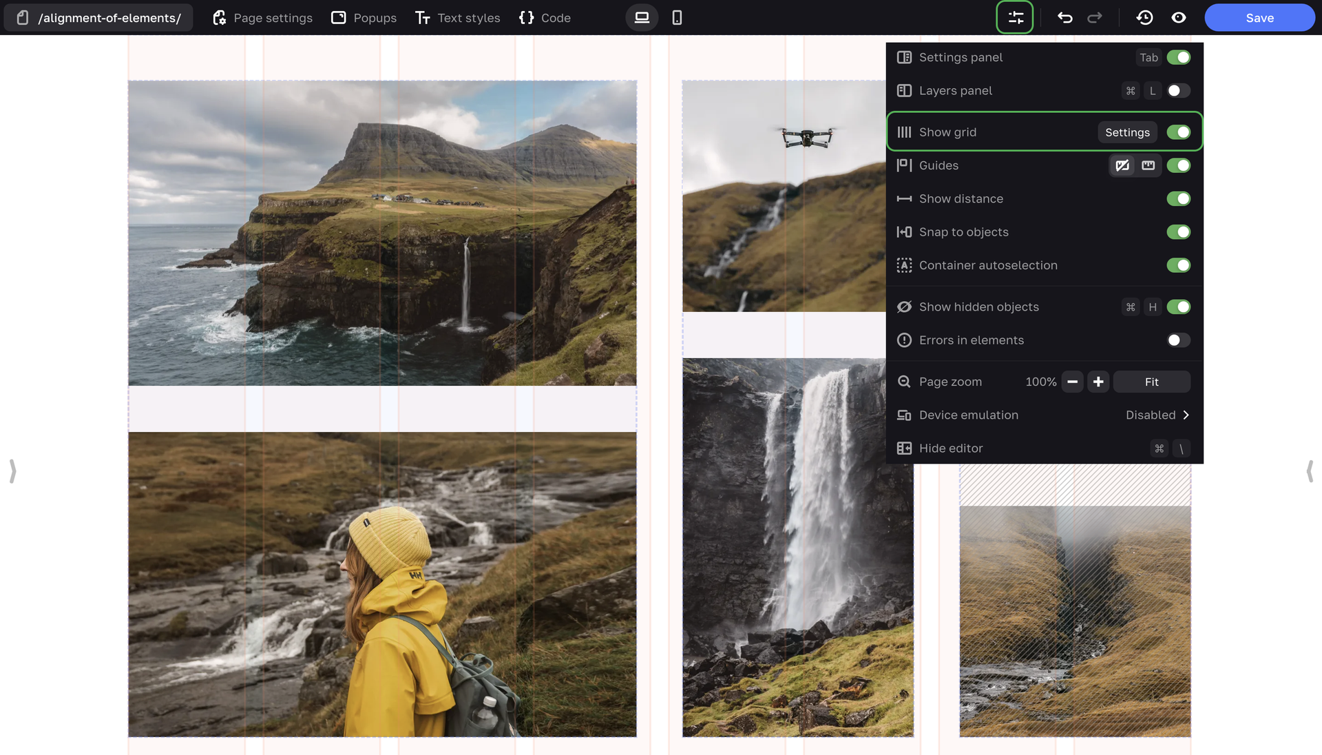
Enter the number of columns in the grid (from 2 to 46), their width, color and gaps between columns. The grid doesn't affect the height of elements, only their width. This is done because your site is displayed on devices with different viewports, the height of elements changes accordingly, and you can't influence this parameter.
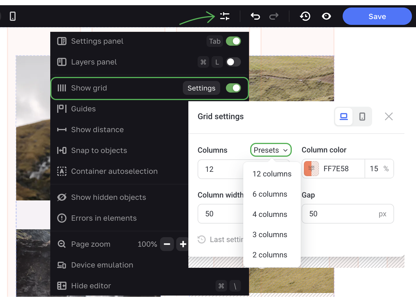
You can also use Presets that offer a specified number of columns, width and gap values.
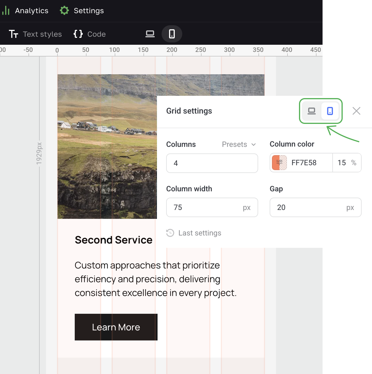
Go to the Mobile only mode to set up the grid for mobile devices.
Guides
To align content on the page, you can also use guides, that is auxiliary lines that help you precisely position elements and arrange the layout of your page.
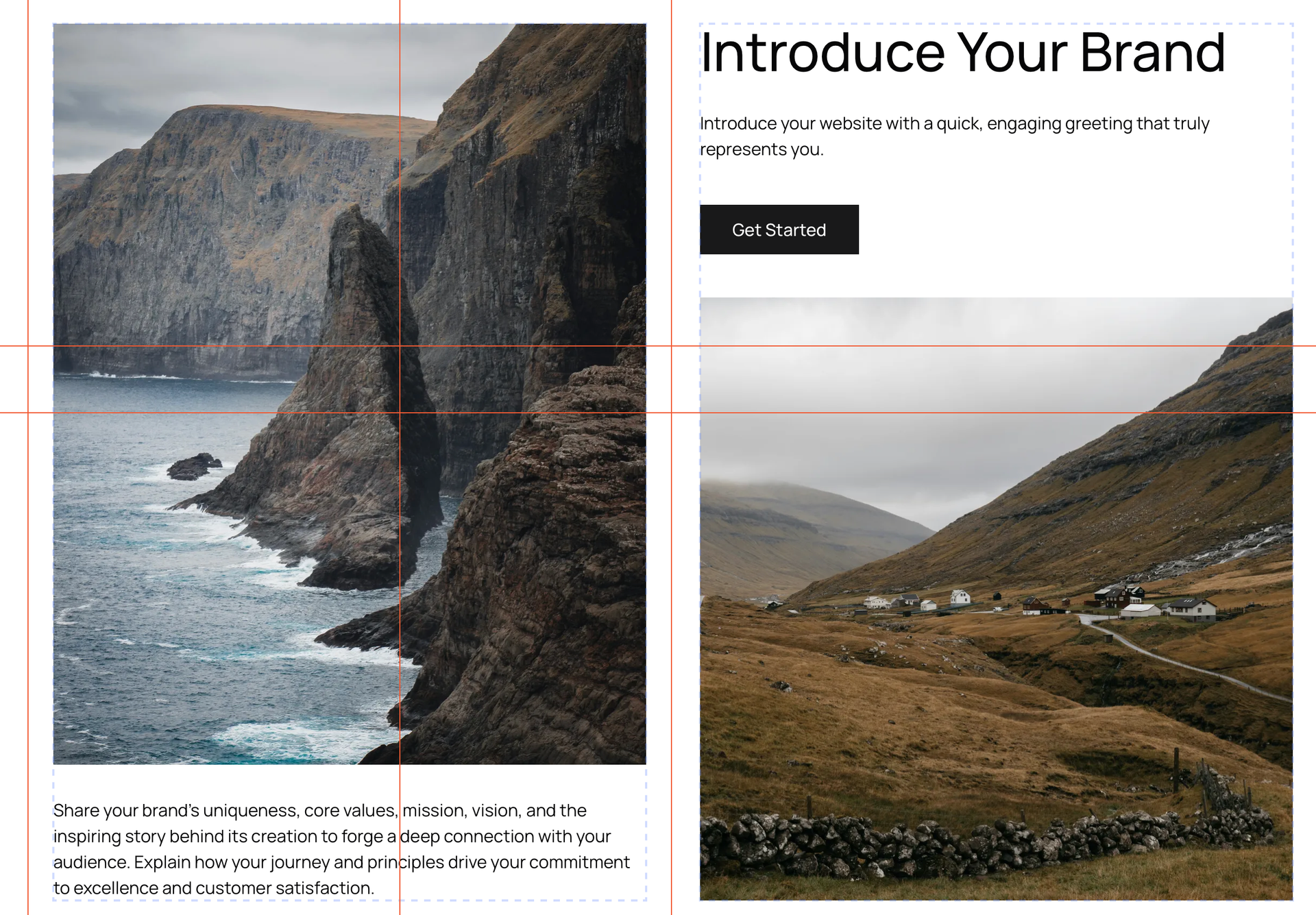
Guides come in handy when you want to border a content area on both sides, to mark the center axis that serves as a trajectory of movement and directs users' attention through the page connecting all the key points of the site.
To enable the guides, switch on the Guides toggle in the Editor options. Then choose between Floating rulers that appear only when you're moving a guide, and Fixed rulers that are always visible.
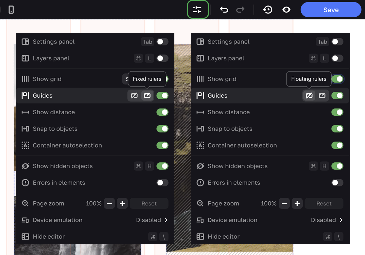
There are two ways to add guides. First, you can add them through the context menu.
You can also pull guides from the rulers.
To delete a guide, click on the X. To delete several guides, press and hold ⌘ (Mac) or CTRL (Windows), select the required guides and click on the X.
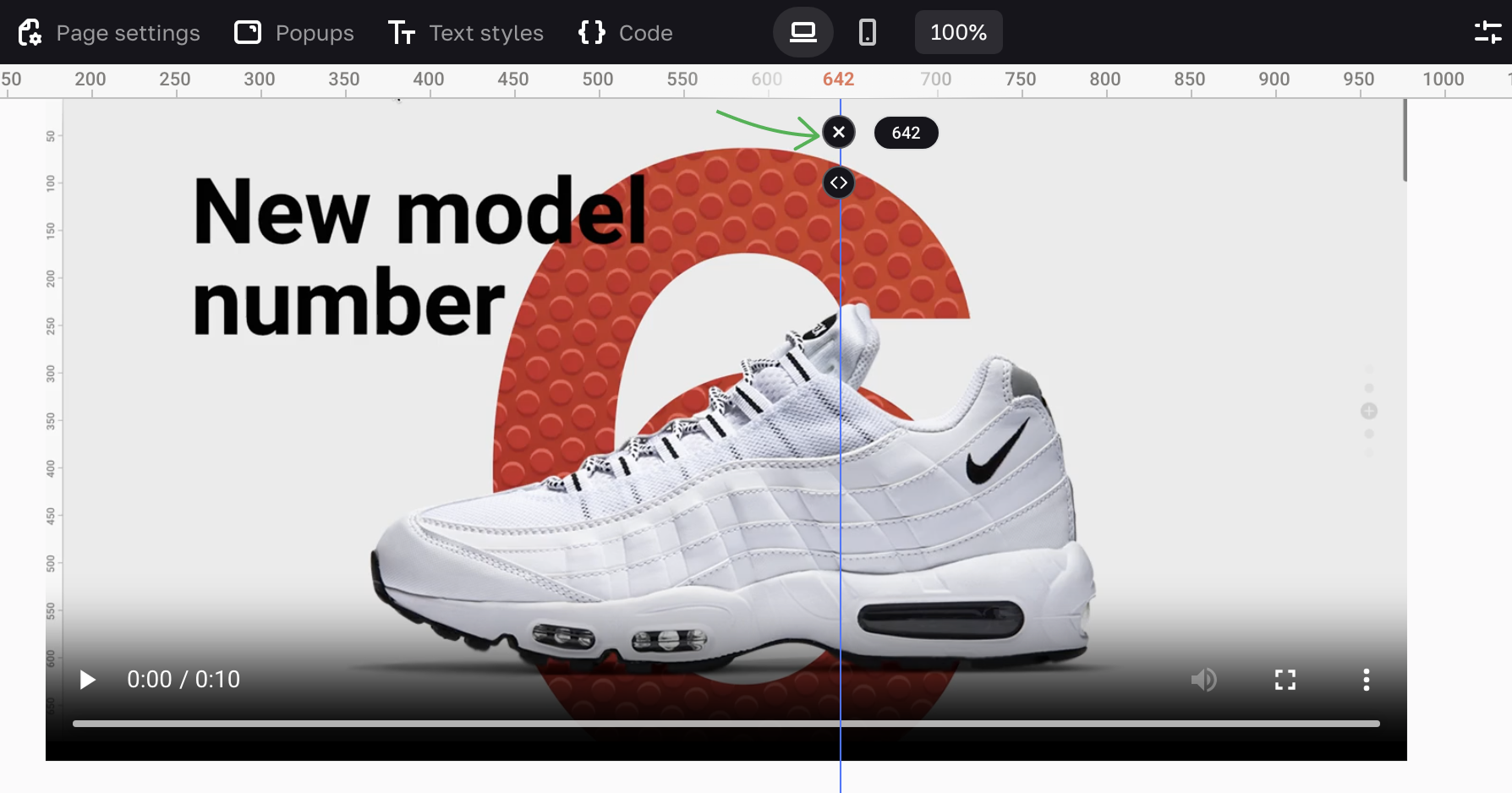
Snap to objects is an option that helps working with the guides.